CAB and RTTL: an immersive experience to communicate a new way forward
Repubblica e Cantone Ticino
Dipartimento del Territorio
Client and goals
Between 2019 and 2020, the collaboration between Ander Group and Canton of Ticino was enriched by a new important chapter. In fact, we were involved in the launch of the Agno-Bioggio bypass and the new tram-train network in the Lugano area, two ambitious projects of the Department of Territory that will bring major improvements to the road system in this area in the coming years.
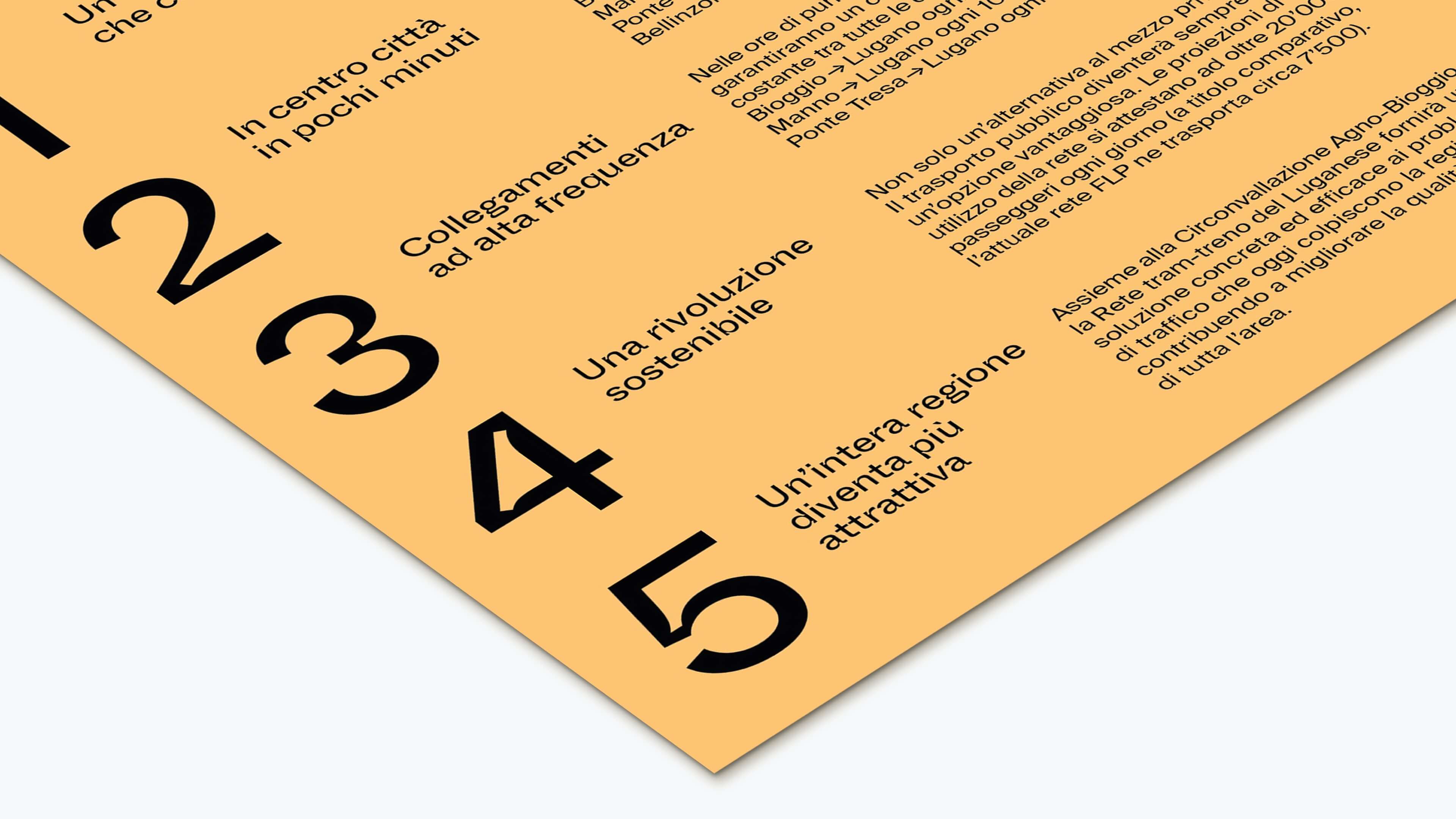
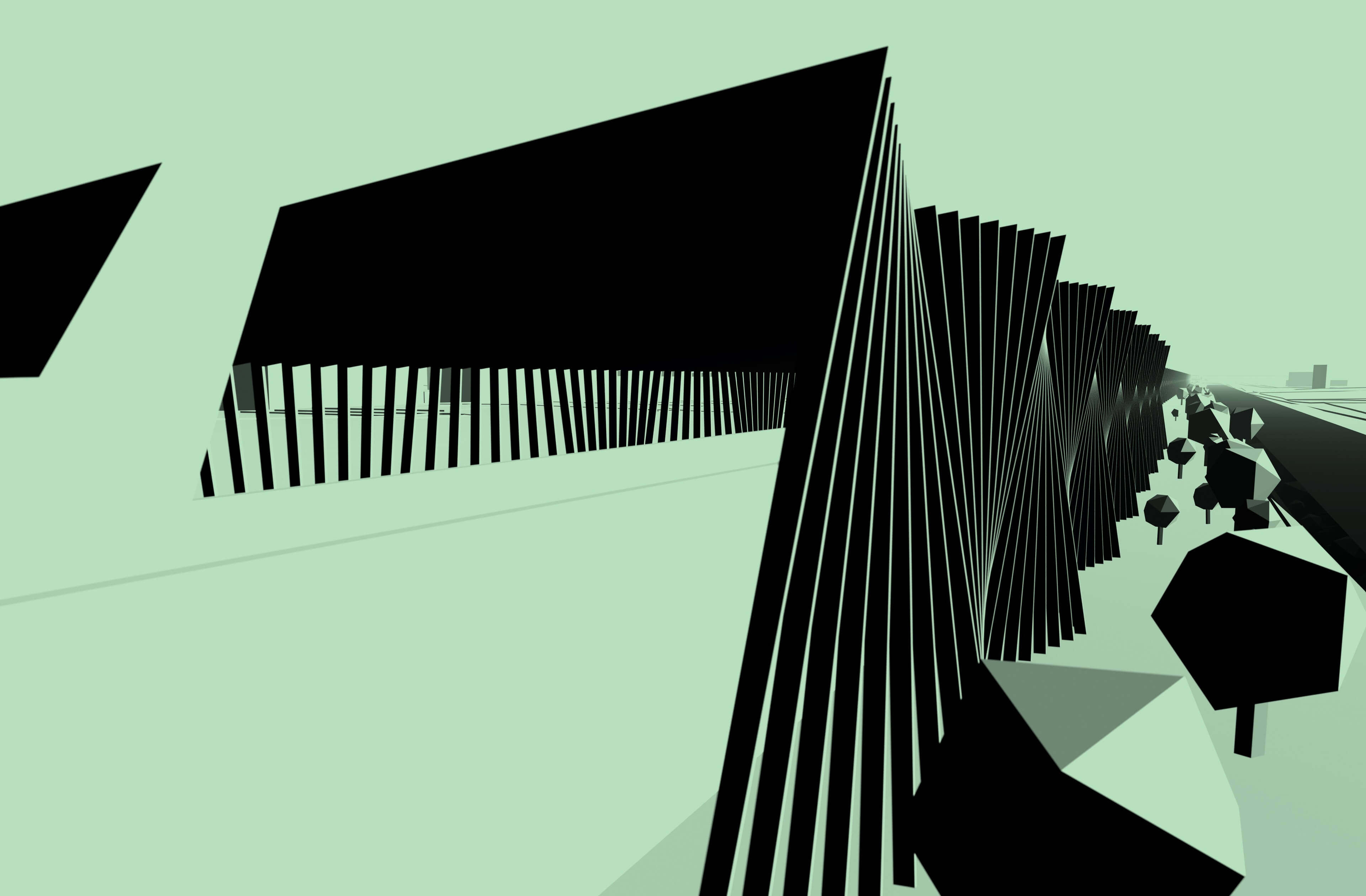
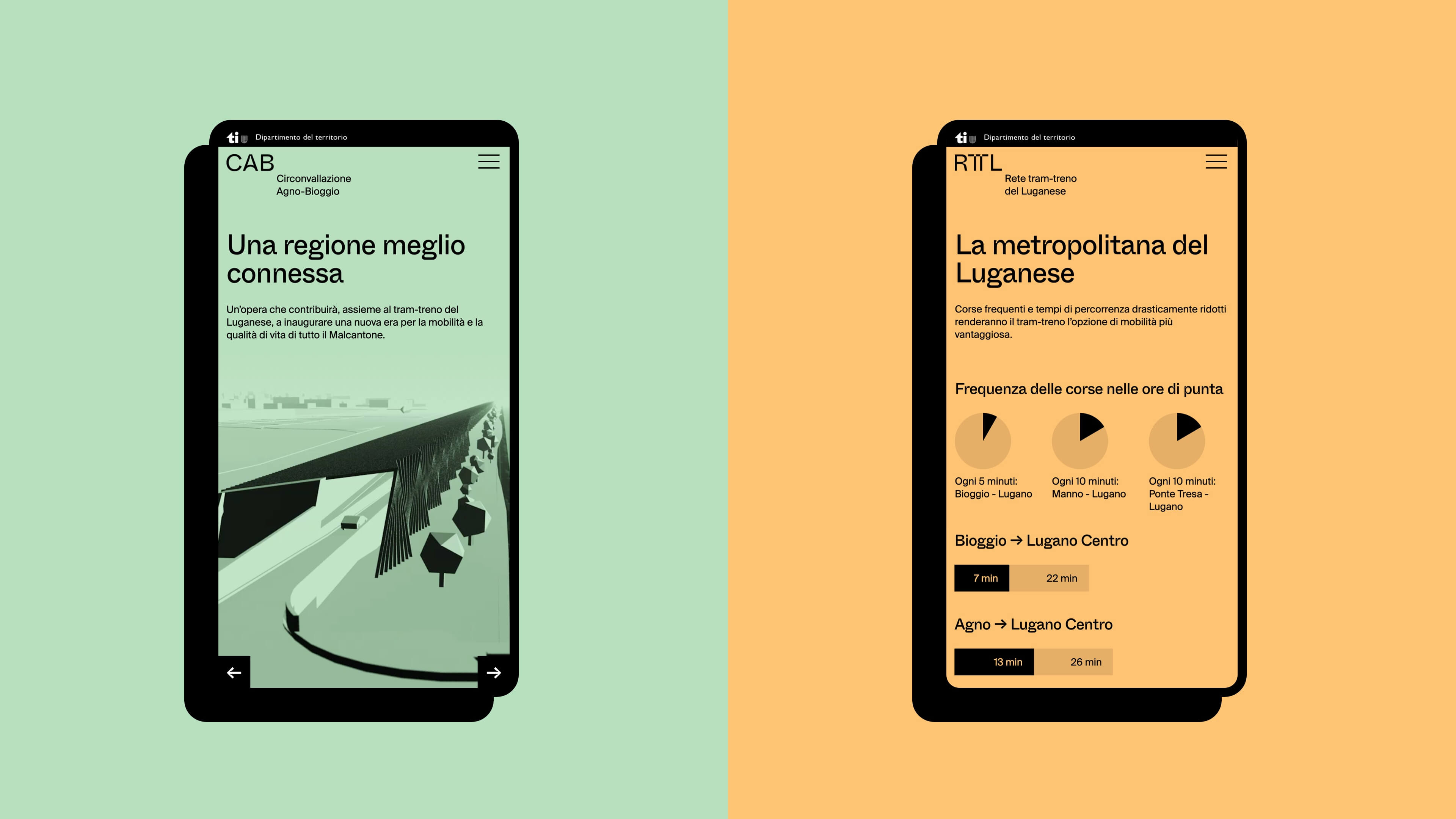
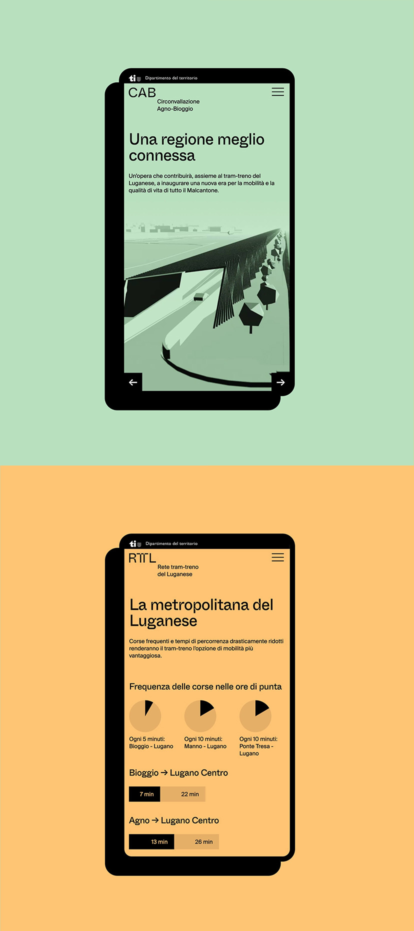
Created and developed in parallel, the two projects were conceived by Ander Group as "twins": that is, they share the same visual identity and the same communication tools - website and offline materials - which differ only in their main colour.
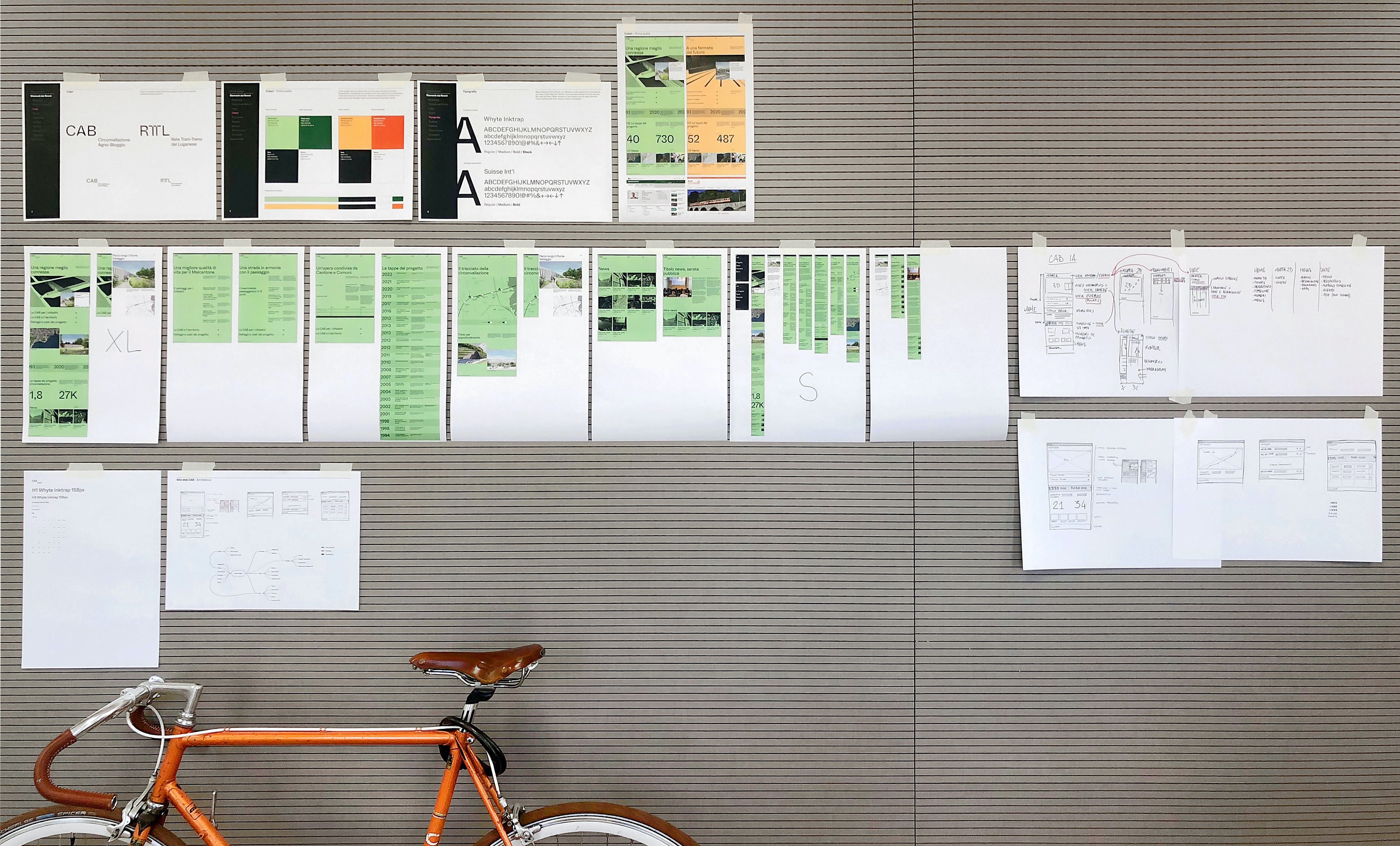
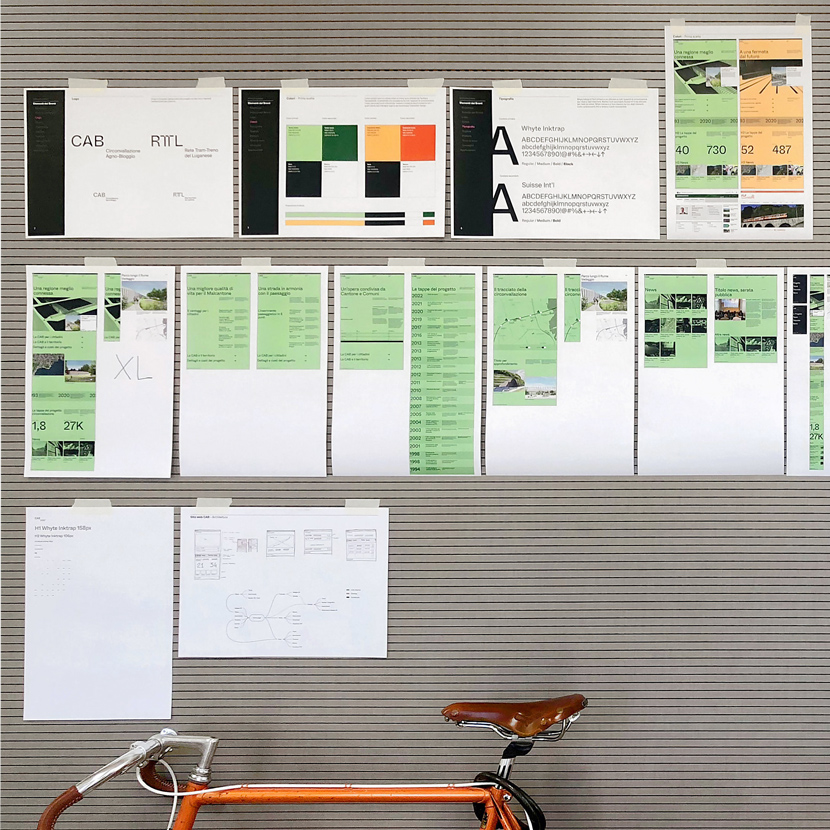
New identity between past and future
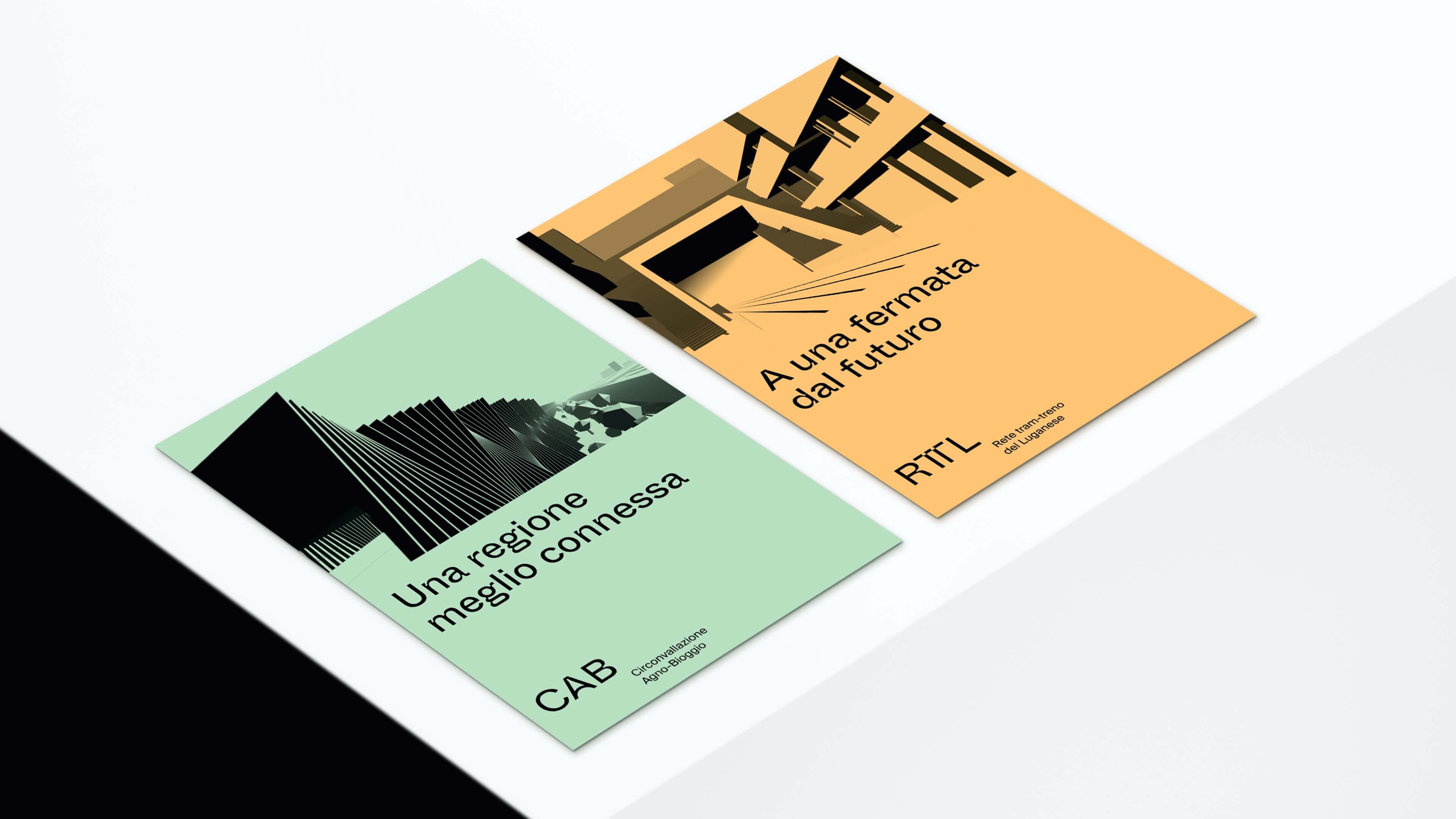
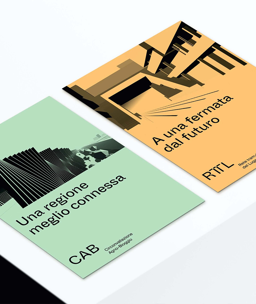
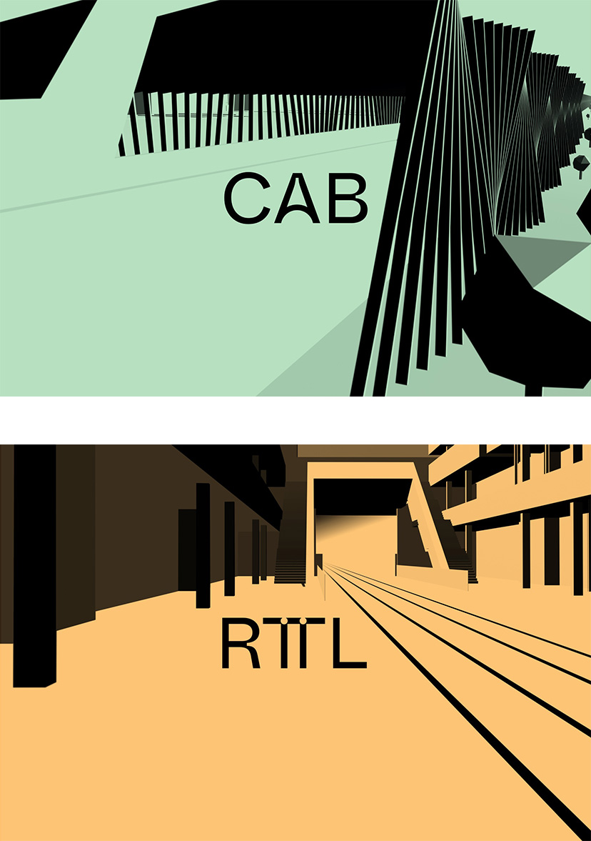
The first strong identity element of the two projects is precisely the colour: two light pastel shades, to promote readability. Green for the CAB, to recall the institutional colour of the Department of the Territory, and orange for the RTTL, i.e. the colour that distinguishes the Ferrovie Luganesi, the company responsible for managing the rail and tram network. The font chosen for the first-level titles is also very recognisable: it is Whyte Inktrap, a typeface that fits in well with the requirements of the project because it is rich in curves and breaks, almost as if to recall a track.
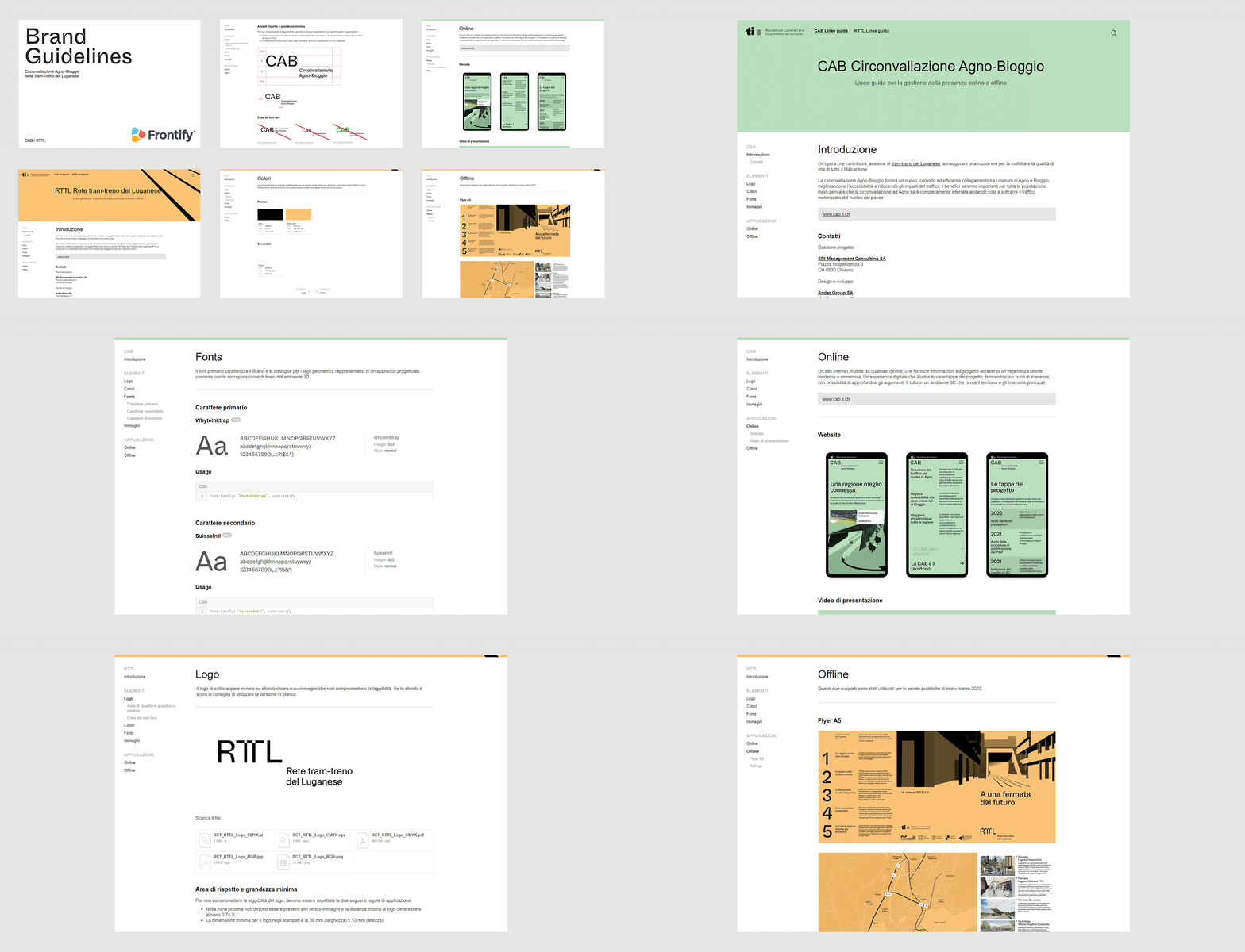
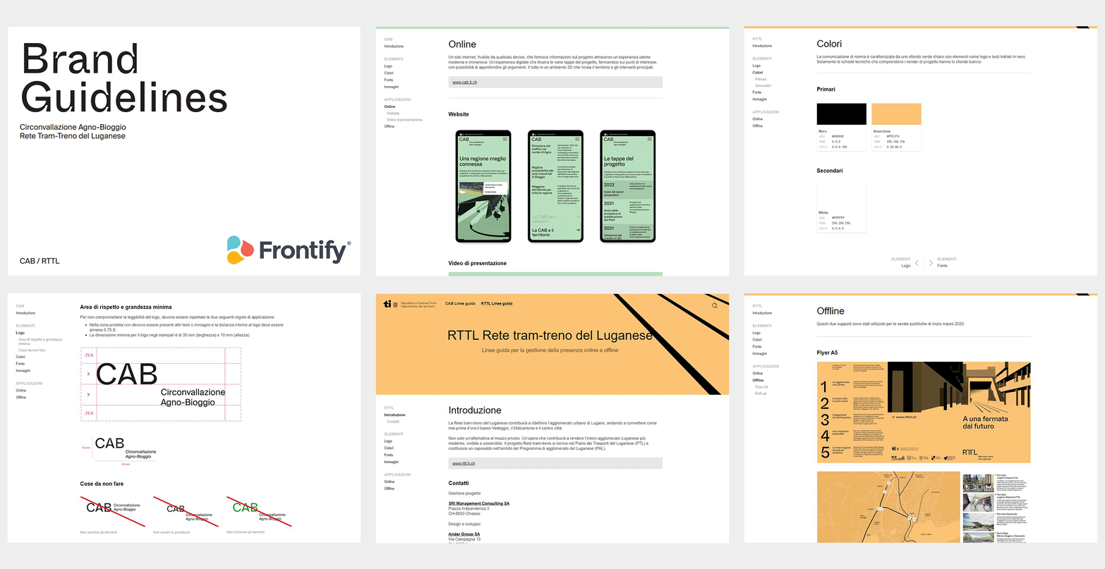
The same font, with some customisation, was also used to create the two logos for CAB and RTTL. After developing the two identities, we gathered the guidelines and key elements in Frontify's digital library: as a Frontify Partner, we provided the Canton with a user-friendly and updatable tool to ensure optimal future management of communication materials.

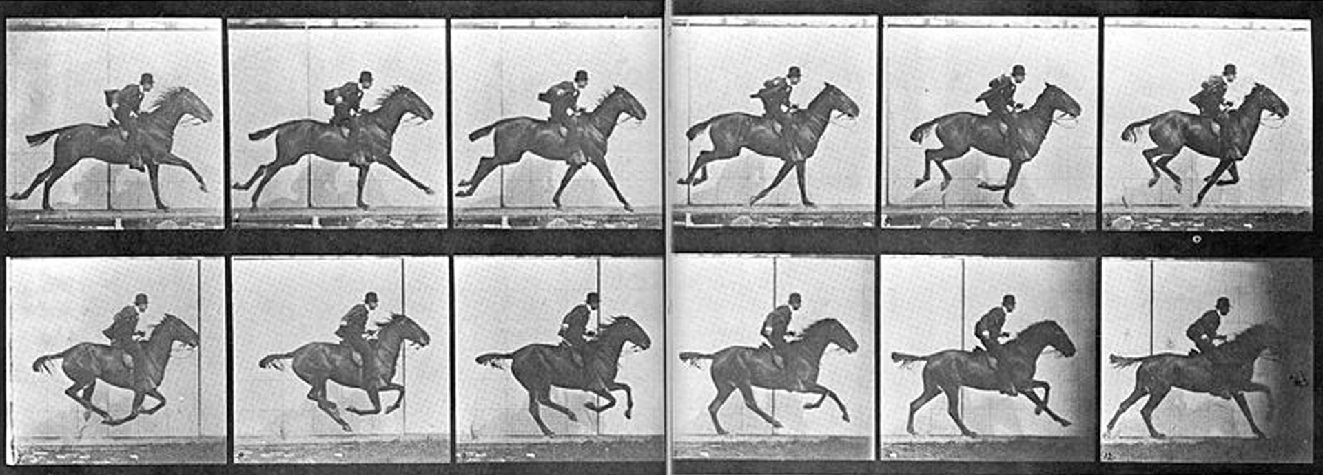
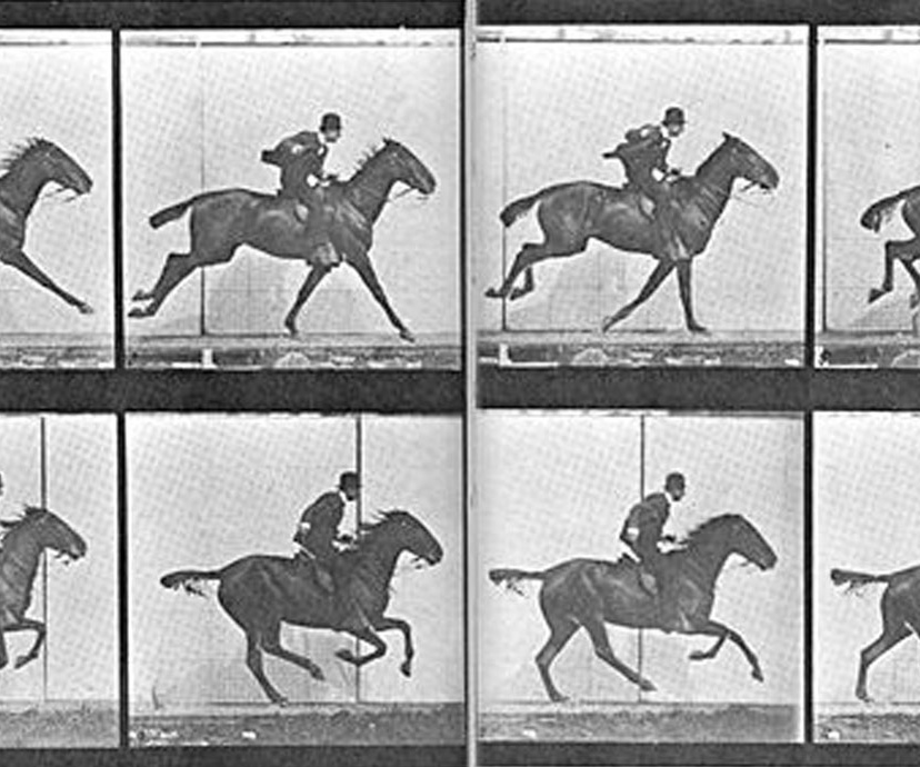
An immersive experience from the ancestor of cinema
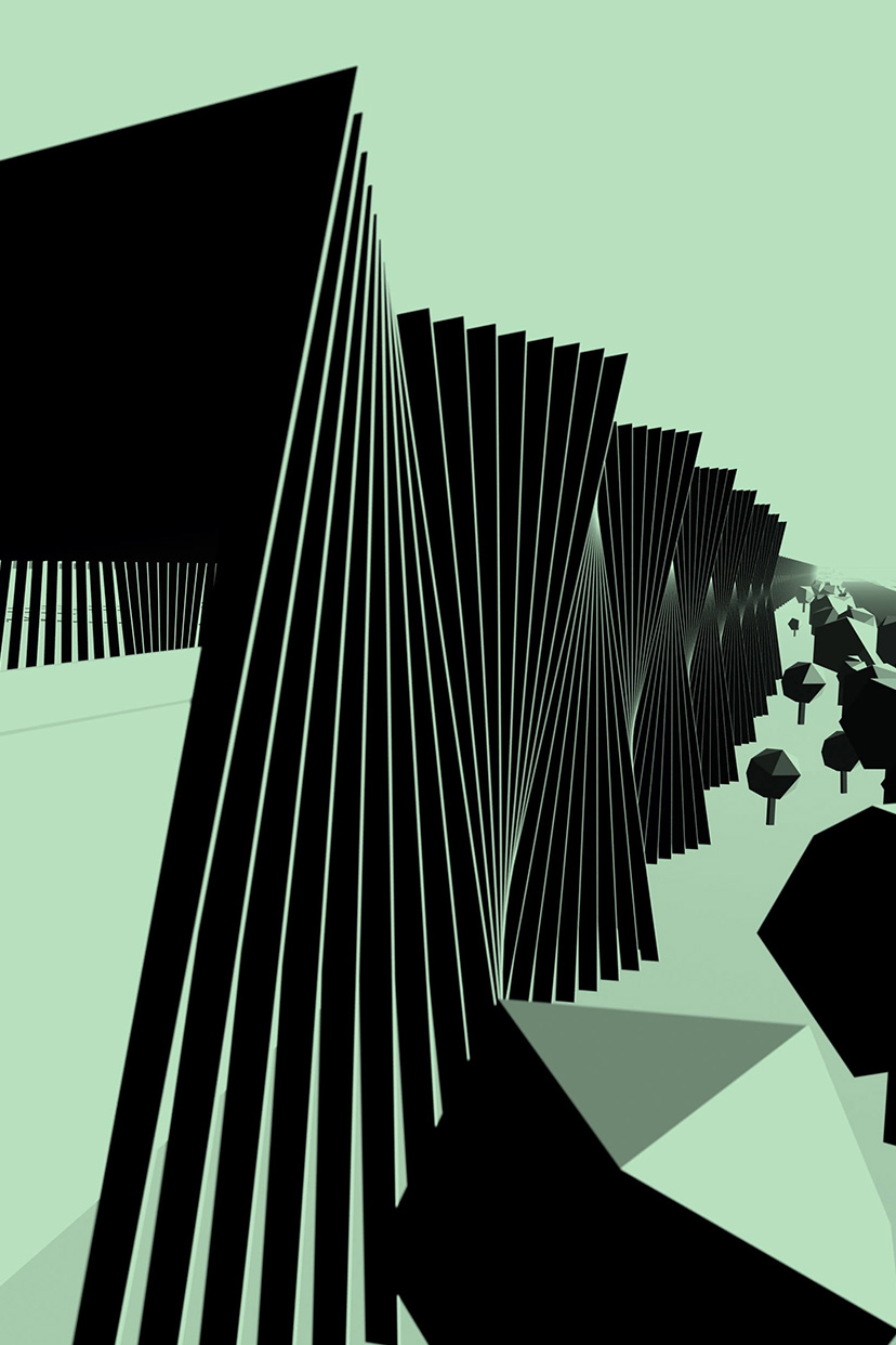
Between 3D and minimalism
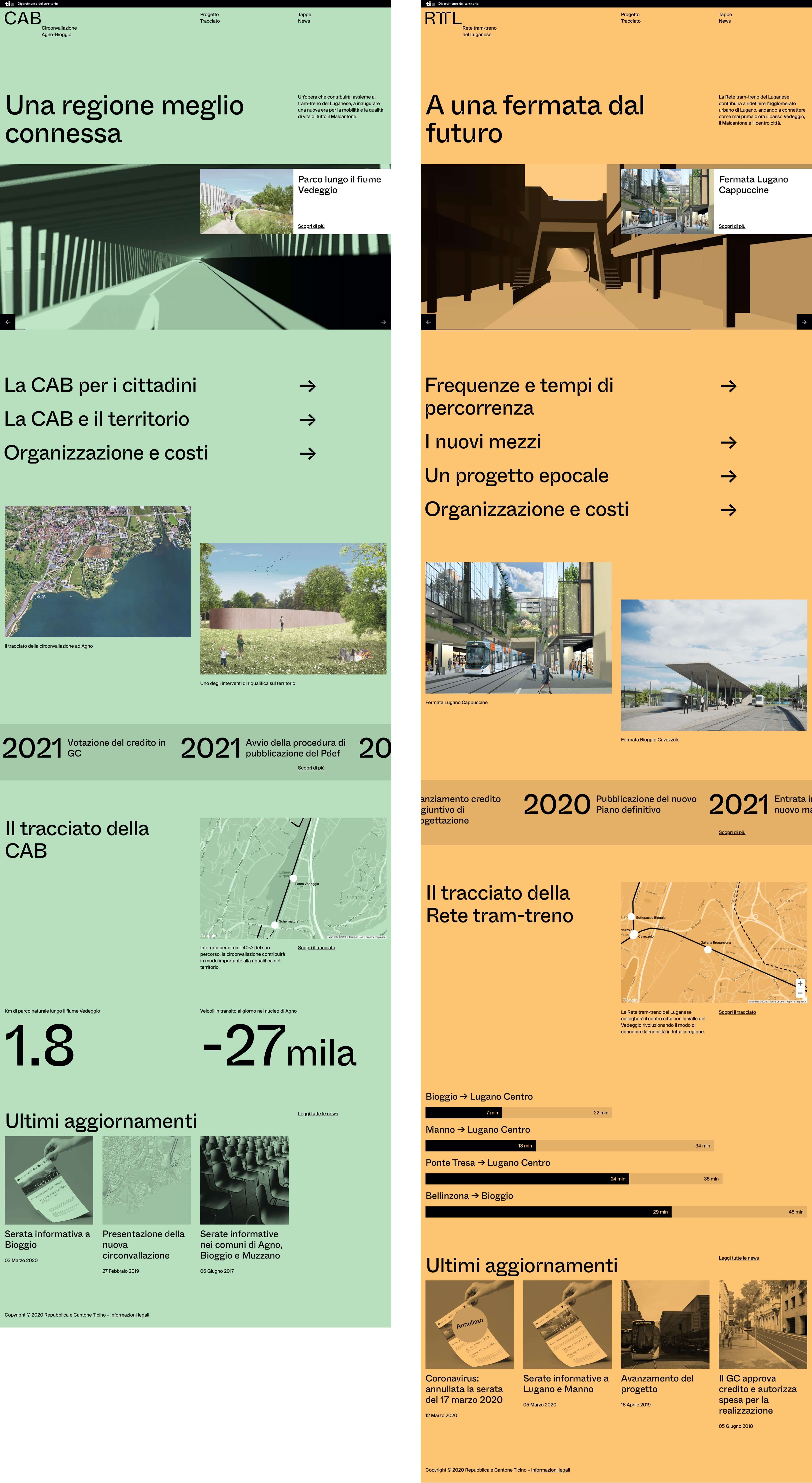
In conclusion, the site is very linear and minimalist and favours the use of the textual content, created by the consulting company with which we carried out the project.

Compatibility with all devices
The cleanliness and simplicity of the two sites also meets another fundamental requirement: that of developing a product that is technologically compatible with all devices.
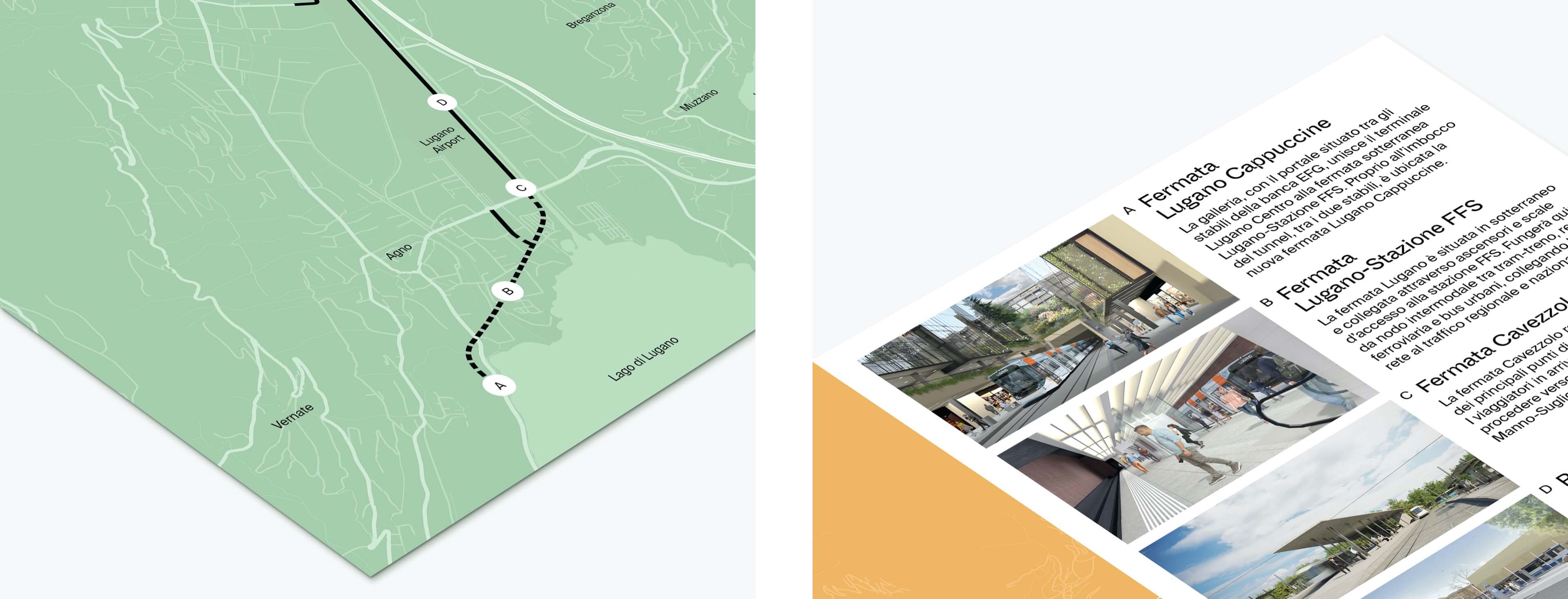
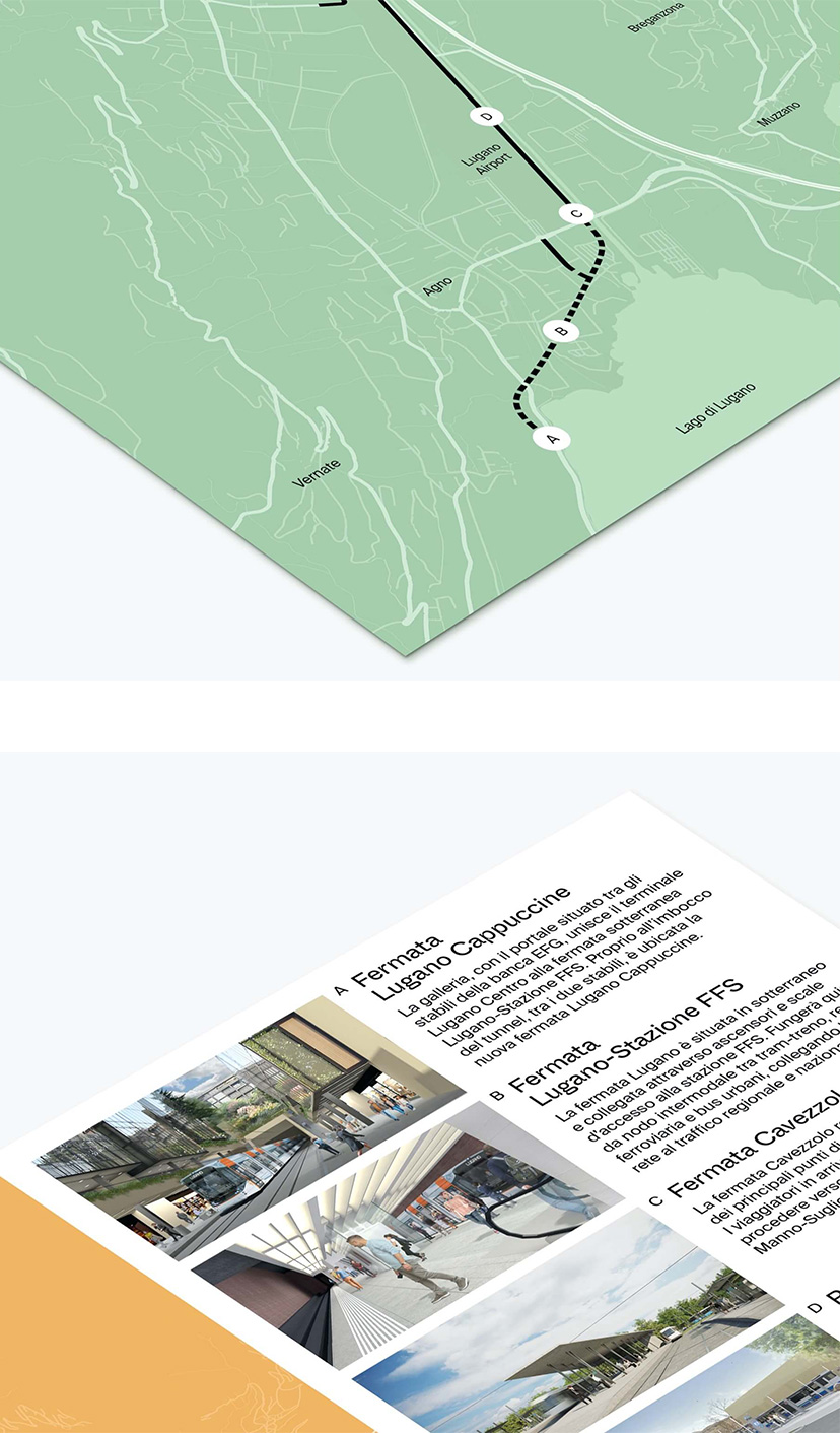
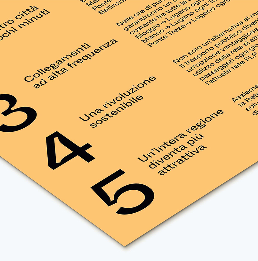
Flyer and roll-up for the project launch
