A user experience strategy to nurture users
Croce Rossa Ticino - Case study

Enhancing the relationship with its contacts and creating centralised communication
HubSpot web design
Social media pages
Contact management
Responsive website design
Improved user experience (UX)
Increased contacts
Increased user engagement
Goals
The importance of UX to improve the relationship with users
More than 10 years after the publication of the first site, the desire of Croce Rossa Ticino was to enhance the relationship with the existing and potential public as well as to promote communication with donors and volunteers who represent the beating heart of the Association.
Ander Group's strategy for Croce Rossa Ticino
- User behaviour evaluation
- User experience analysis (UX)
- Implementation of a digital ecosystem with HubSpot CRM
Why is the user experience important?
In a world where online communication requires keeping pace with technological evolution and acting with a "digital first" approach, it is essential to think of websites that offer a positive experience for the user in terms of both ease of use and aesthetic appeal.
The user experience also encompasses all those traits linked to satisfaction, value and usefulness and is the key to nurturing a good relationship with your visitors.
Furthermore, its key role in improving SEO should not be underestimated, as some user experience parameters are considered among Google's ranking factors for search engine positioning.
From analysis to website architecture
Croce Rossa Ticino, set up in 1996, wanted to present itself as the cantonal association of the Swiss Red Cross, which brings together the four regional sections covering the entire territory: Bellinzona, Leventina, Locarno and Sottoceneri.
The main challenge was to communicate this change through a website feautirng a responsive design, without distorting the identity of the individual sections, each delineated by its own physiognomy, history and legal personality, but also without disorienting the user who - since ever - is bound to search for activities starting from his section of origin.
The first step was the analysis process based on the behaviour of the audience, i.e. which pages were most visited, which services were most needed, the time spent on the site or the type of device preferred.
Subjective perception is often misleading and leads to suppositions based on intuition and not on objective data.
In the case of Croce Rossa Ticino, the data left no room for doubt: there was a clear classification of the most visited services, as well as the surprising fact that 50% of the public preferred the mobile experience. Data in hand, the only direction was to implement a responsive design strategy and rethink the architecture of the site.

What we did
Site navigation
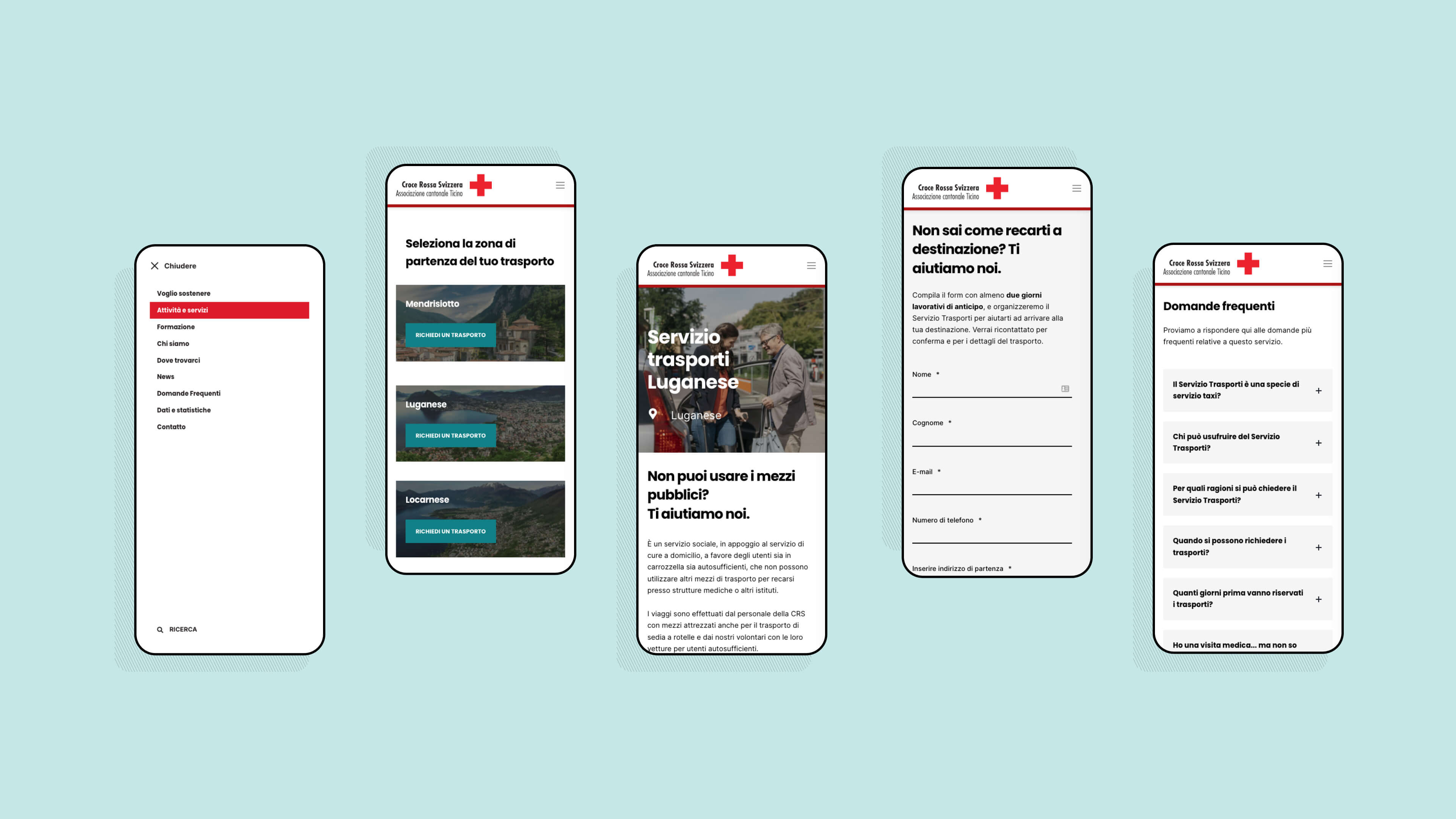
A complex and delicate task that was outlined through the implementation of HubSpot CRM, allowing the creation of a website with clearer and more linear navigation.
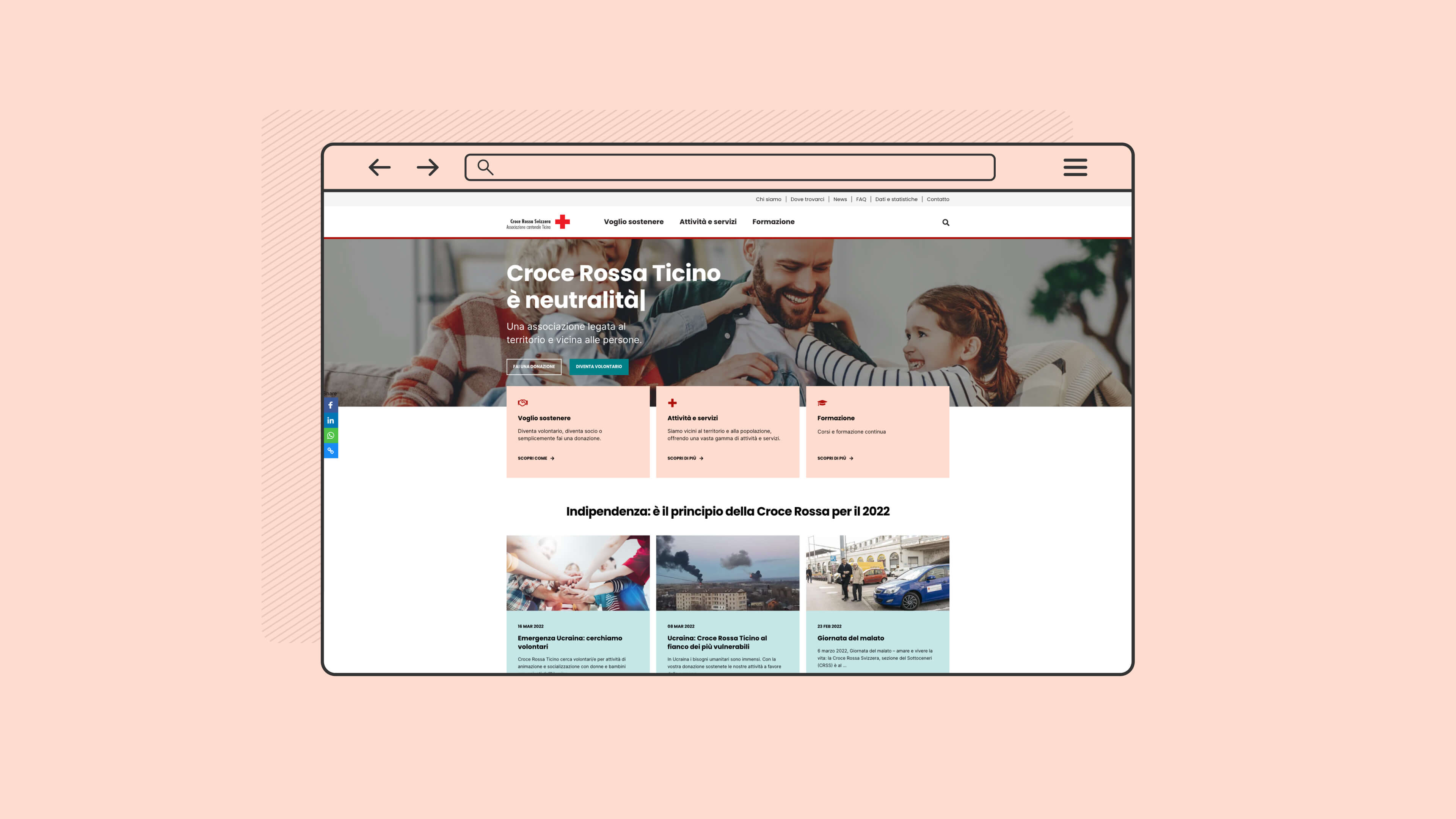
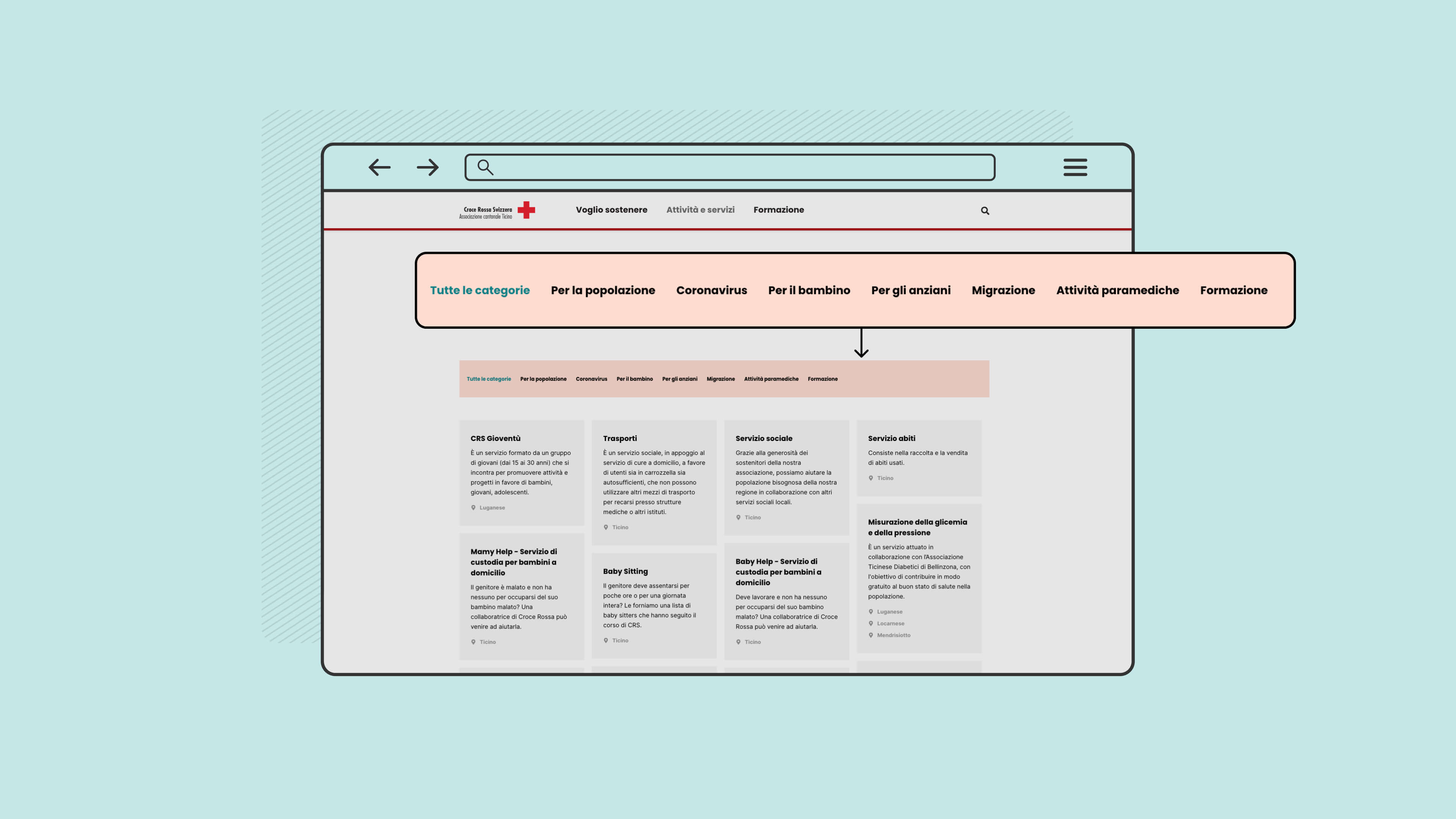
Already on the home page users are filtered by behaviour, whether they wish to support the project or are looking for a service or training courses.
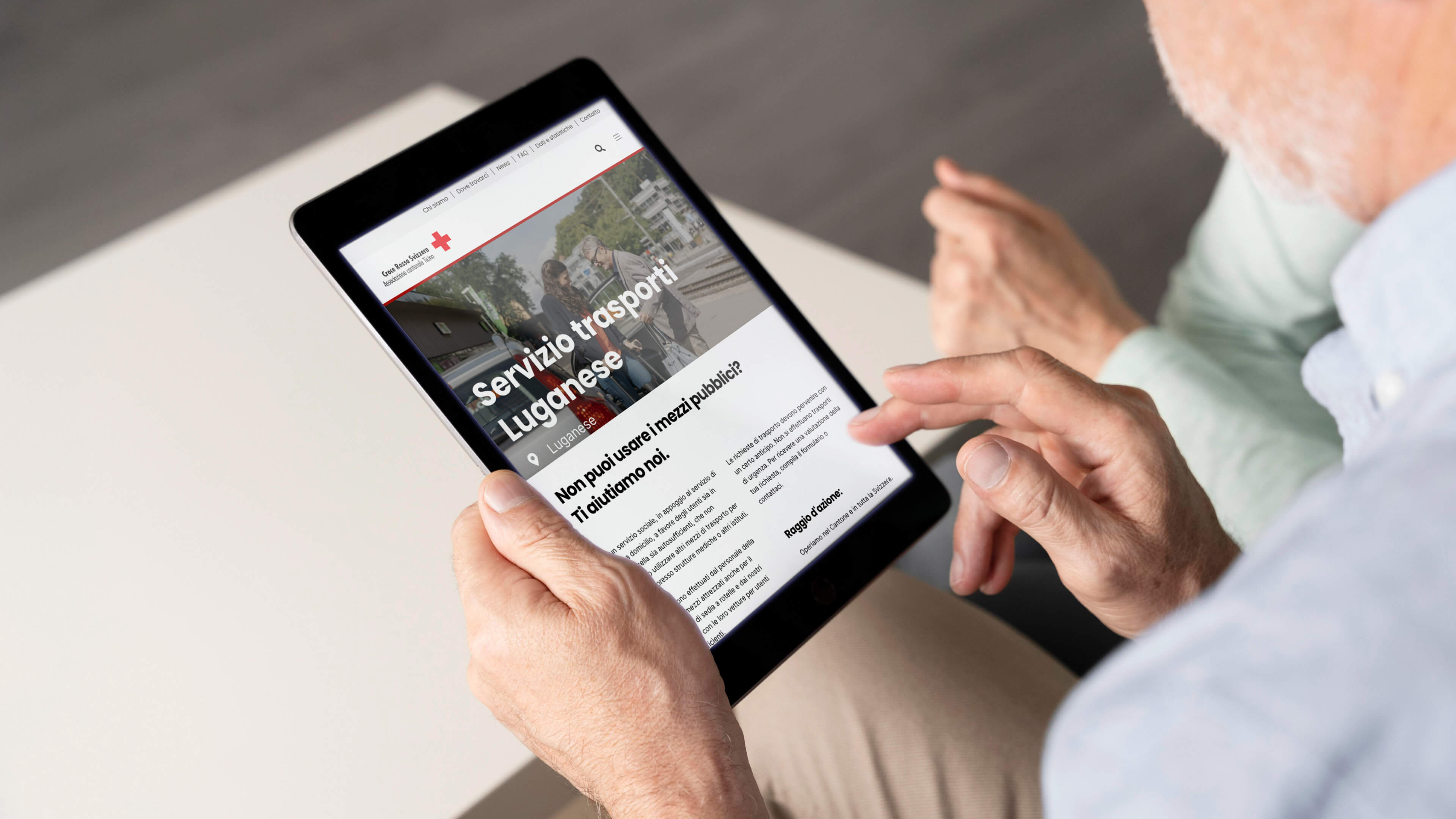
Within the services section, the structure and presentation has been changed, with the emphasis being placed primarily on the service offered, to emphasise its value, and not least on the category of users requesting it (e.g. for the elderly, for children, for the population etc.).
In this new vision, the regional section loses its centrality without being forgotten, but used as additional information.
Also with a view to guaranteeing better results, a general search button has been added to the site.
A digital ecosystem
The implementation of HubSpot CRM has made it possible to improve contact management and relations with the public, which is still strongly tied to paper-based and postal offline communication methods.
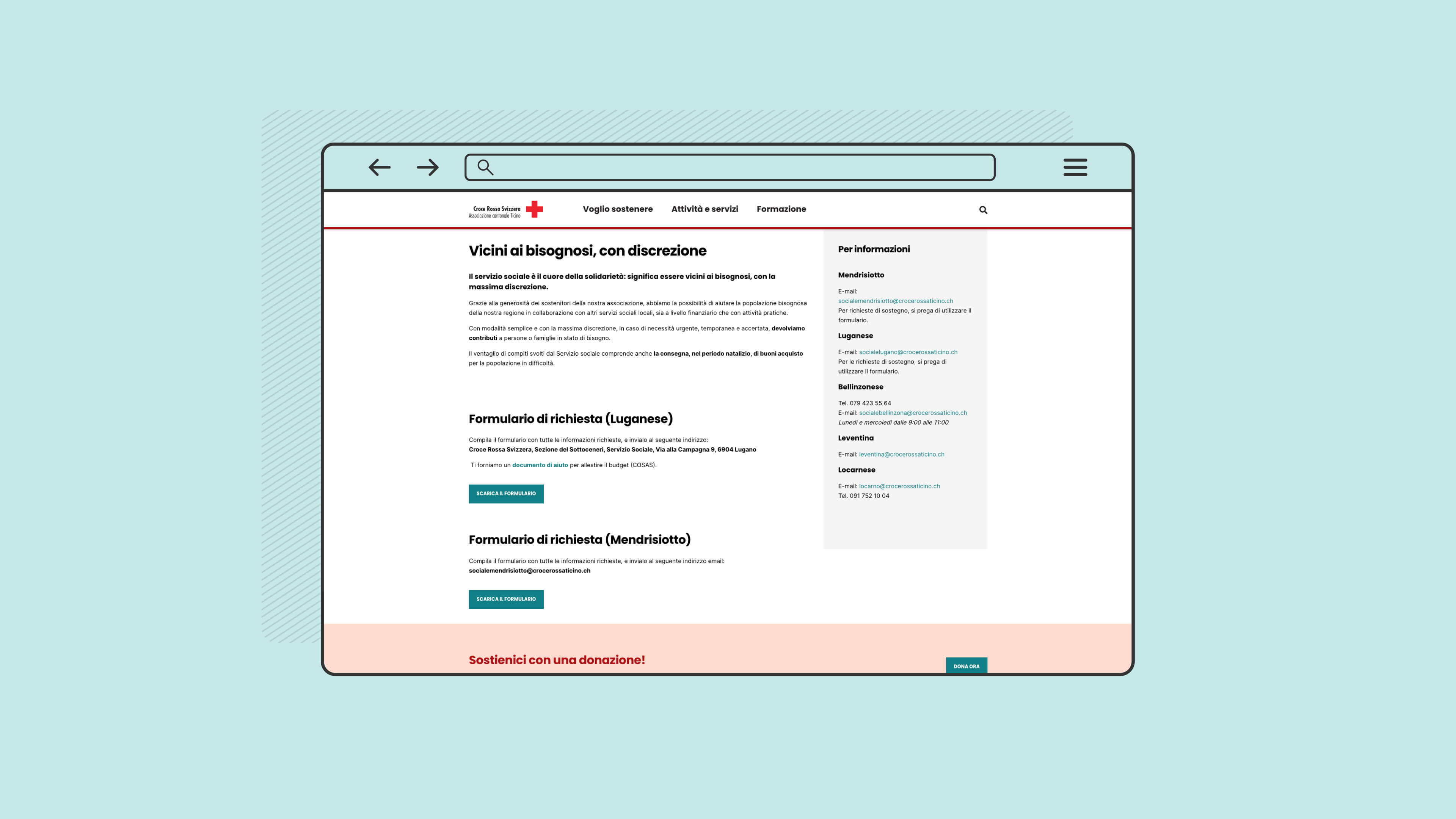
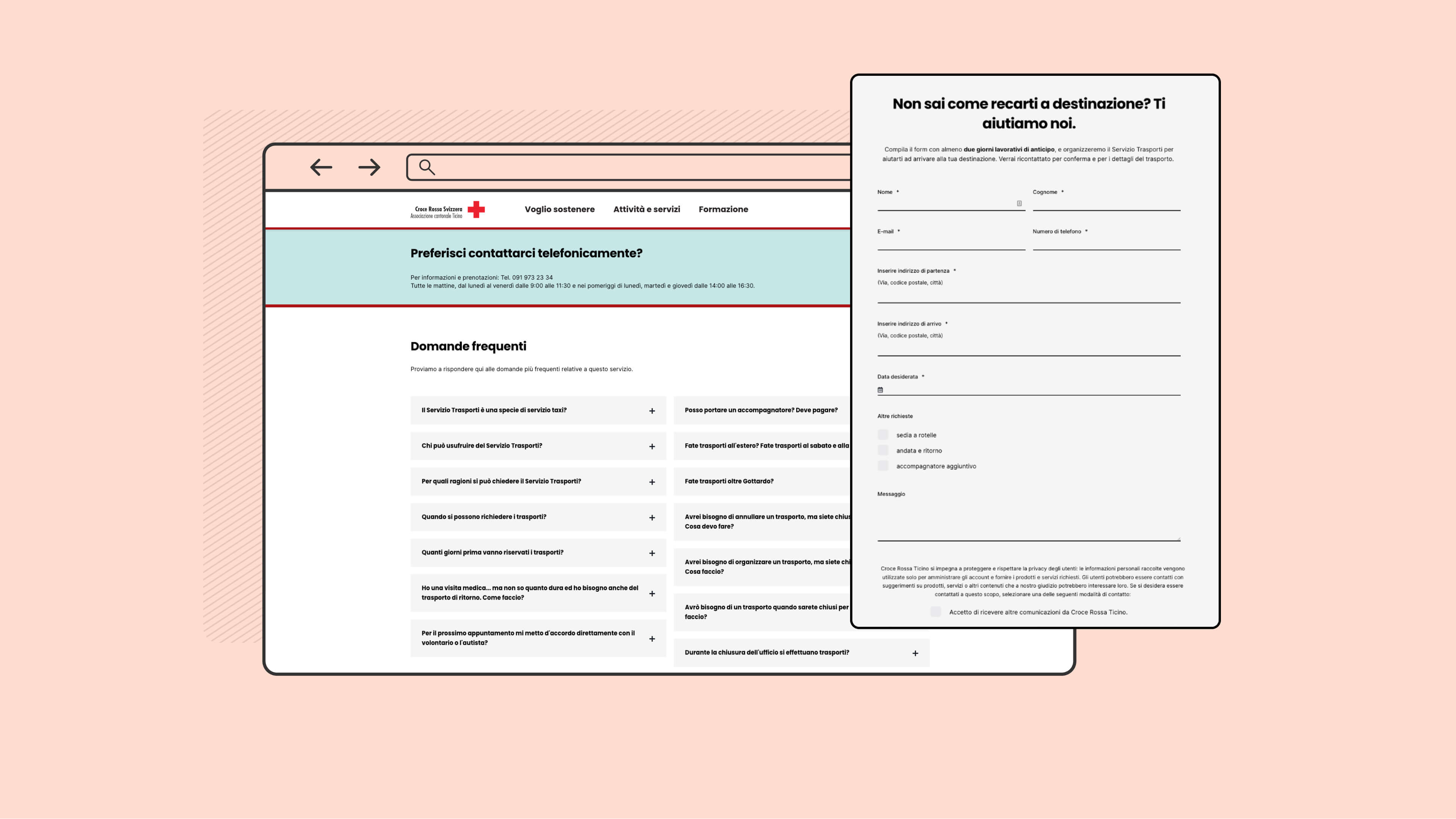
The inclusion of customised forms for collecting personal data has opened up the possibility of implementing effective digital marketing strategies and creating more punctual, targeted communications (including through dedicated newsletters) and establishing a relationship with users and supporters.
In addition, the implementation of the forms has improved the efficiency of the management of services and the internal organisation of the Red Cross, as it is possible to convey the service request directly to the contact person without going through the administrative team.
Responsive design and an adequate visual
In terms of visual design, Croce Rossa Ticino website has been adapted (in terms of colours and lines) to the Swiss Red Cross website, taking up the tones of brass and pink.
The website has been created in a responsive view for the visualization and the correct adaptation on devices of different sizes.
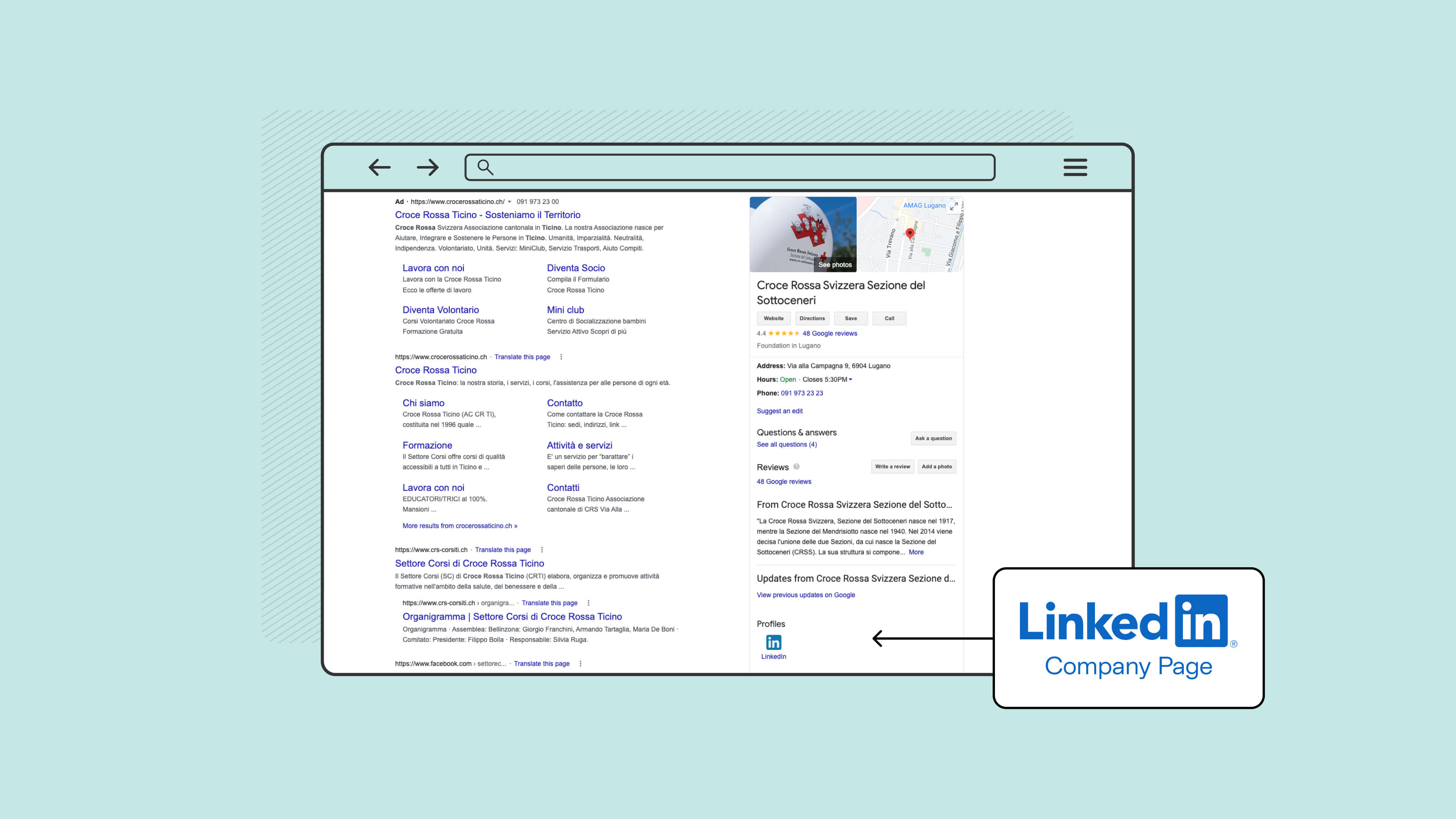
LinkedIn & Facebook
In order to better communicate its reality as a single cantonal association, and as a point of reference for the four regional Ticino sections, as well as to further nurture communication with its users, including institutional ones, a company page was created on LinkedIn and the individual section pages that had previously been created were consolidated into a single Facebook page.
