<img alt="" src="https://secure.leadforensics.com/222484.png" style="display:none;">
Skip to content

Design, manage and protect a brand digital presence in the financial industry

Aequitum
AEQ_01-3
AEQ_01_mobile
Client
Aequitum SA
Our approach
Branding, experience
Year
2016

Clients and goals

Aequitum is an independent asset management company, based in Lugano. Based on human relationships and strong financial skills, the company is builded on trust with its clients around a shared investment strategy. Founded in 2016, Aequitum enrolled Ander Group for its communication, which evolved, during these years, cheek to cheek with the business.

Over time, for Aequitum we have been in charge of creating the Brand Identity; equipping it with the Online and Offline communication channels and assets; optimizing the Database and engaging it with digital content.

The journey

Strategy
Definition of the values of the brand, of its USP, of its tone of voice and drafting of a textual identity document.

Creativity
Creation of the logo, color palette and brand manual to define the rules of logo application and color guidelines.

Design and management
Implementation of the new brand identity on administrative printed matter and office furniture. Realization of a company magazine that tells the values of the brand; of the brochure; of the website, with a first release in 2017 and a second one in 2019; of a periodical newsletter to define a constant contact with the stakeholders. Data processing management and legal support.
AEQ_02

A “classic” logo

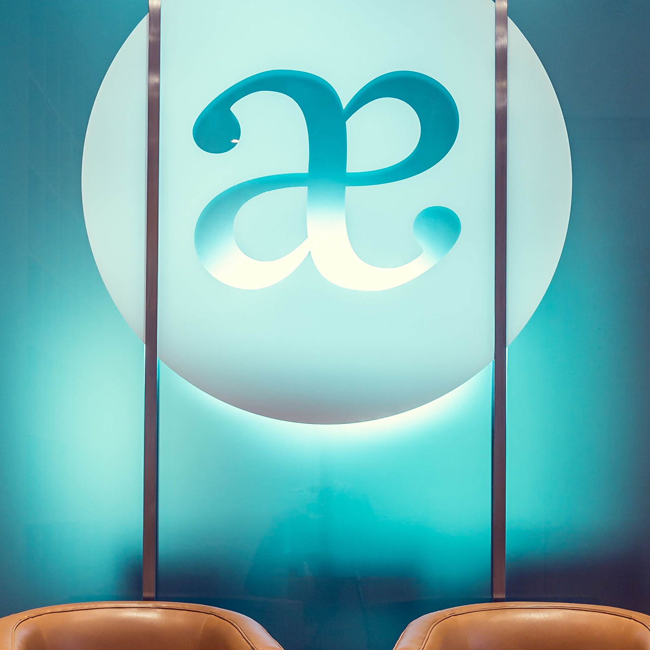
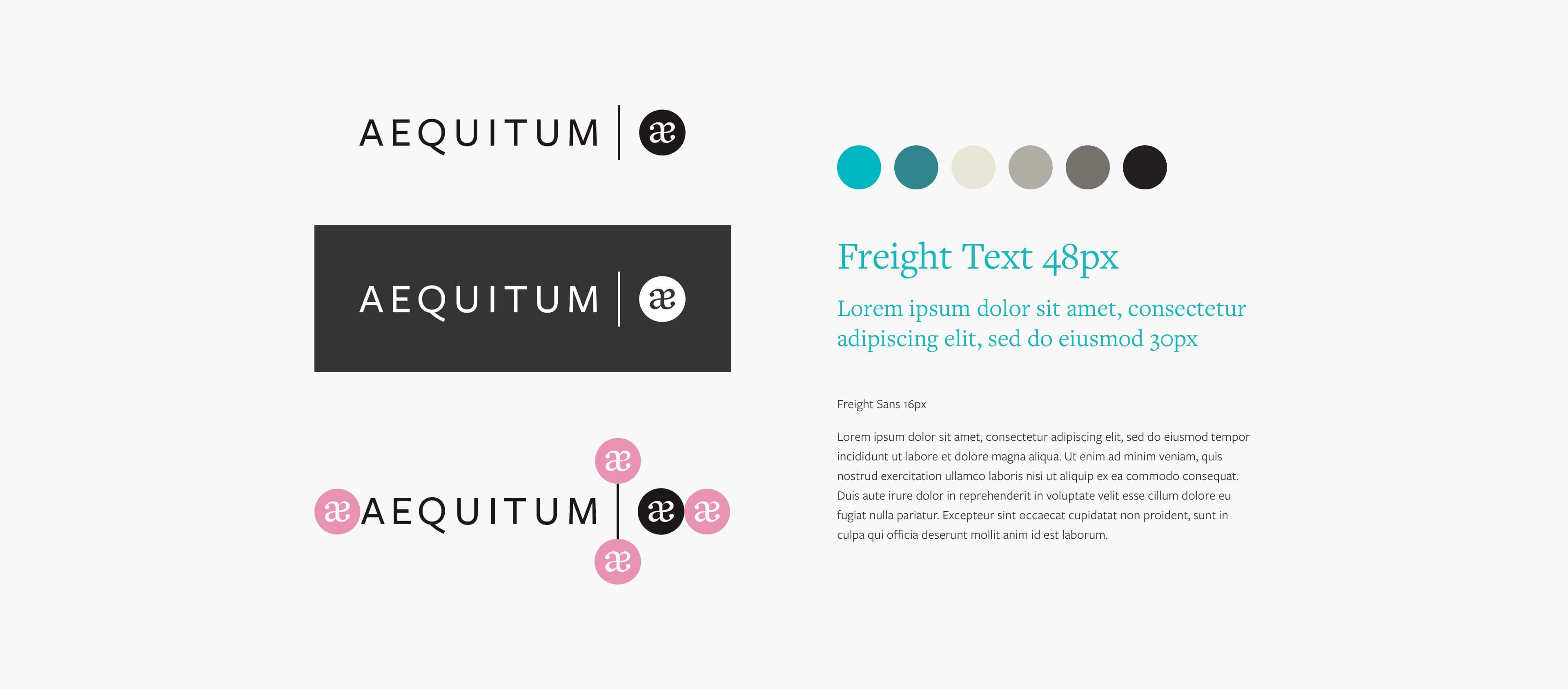
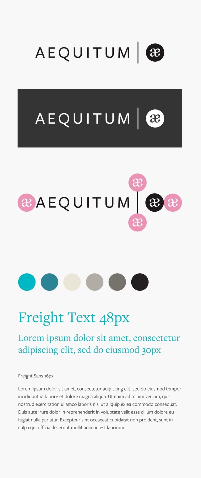
The name Aequitum is about fairness, balance, trust and integrity. To embody these values, we chose a logo that represents the first Latin diphthong of the company's name: and we depicted it in a soft, balanced and symmetrical way.

The two letters come together as Aequitum is linked through strong relationships of trust to its customers, with whom it sets up synergies and shared long-term strategies.
AEQ_03
AEQ_16-3

Minimal elegance

Aequitum's color palette is small and simple, but has an elegant and distinctive impact. In addition to black, grey and white tones, there is a light blue with green tips: an original color that we found useful to highlight some elements of the communication and as an overall background color that characterizes the mood of the site.
The new guidelines have been applied to all the channels and communication materials of the brand, such as the institutional brochure.
AEQ_04
AEQ_18

A special Wanderful edition

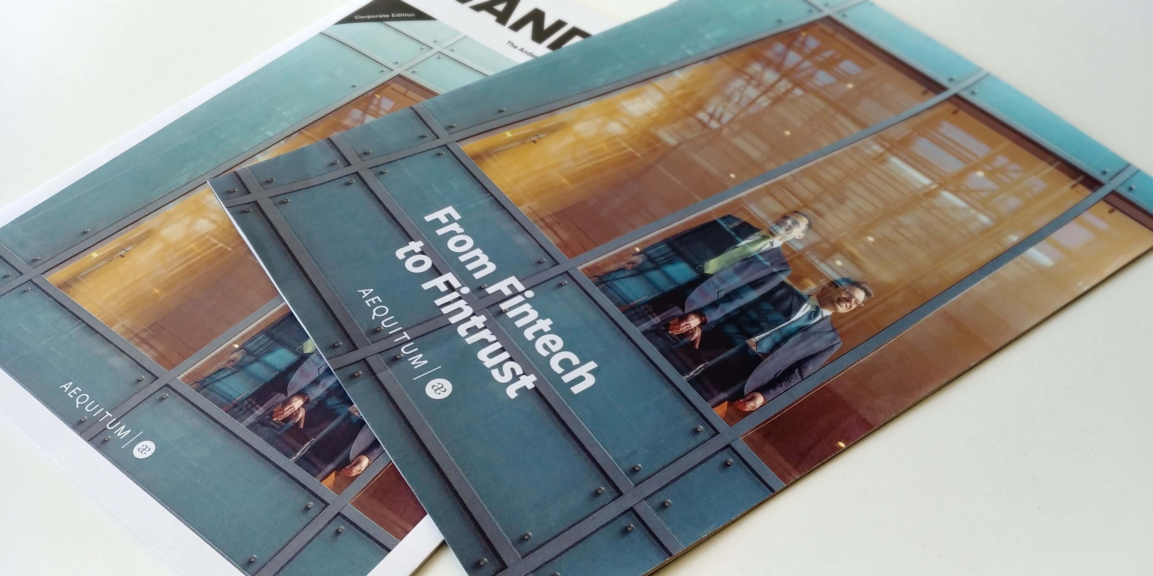
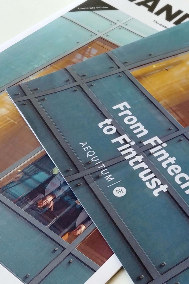
For Aequitum, we created the first corporate version of Wanderful, our Ander Group's magazine. In particular, we have built a monographic issue tailored to the Brand that would tell the essence of the company, its values and give a face to its two founders, soul and core business in the early years of activity. 

We tried to tell the story of Aequitum's activity with warmer and less institutional tones than those usually used by its competitors, precisely to suggest the importance the company gives to human relationships and empathy. "From Fintech to Fintrust" - the cover title - well explains this concept.

A customised shooting
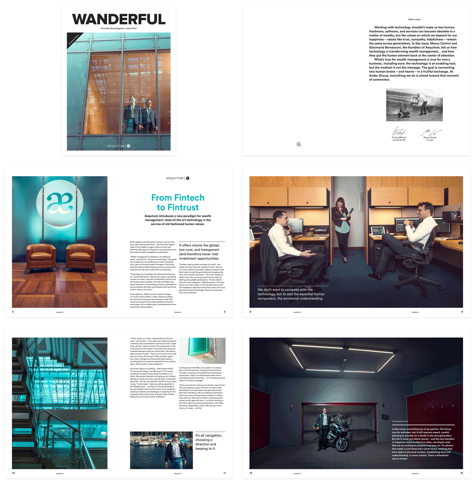
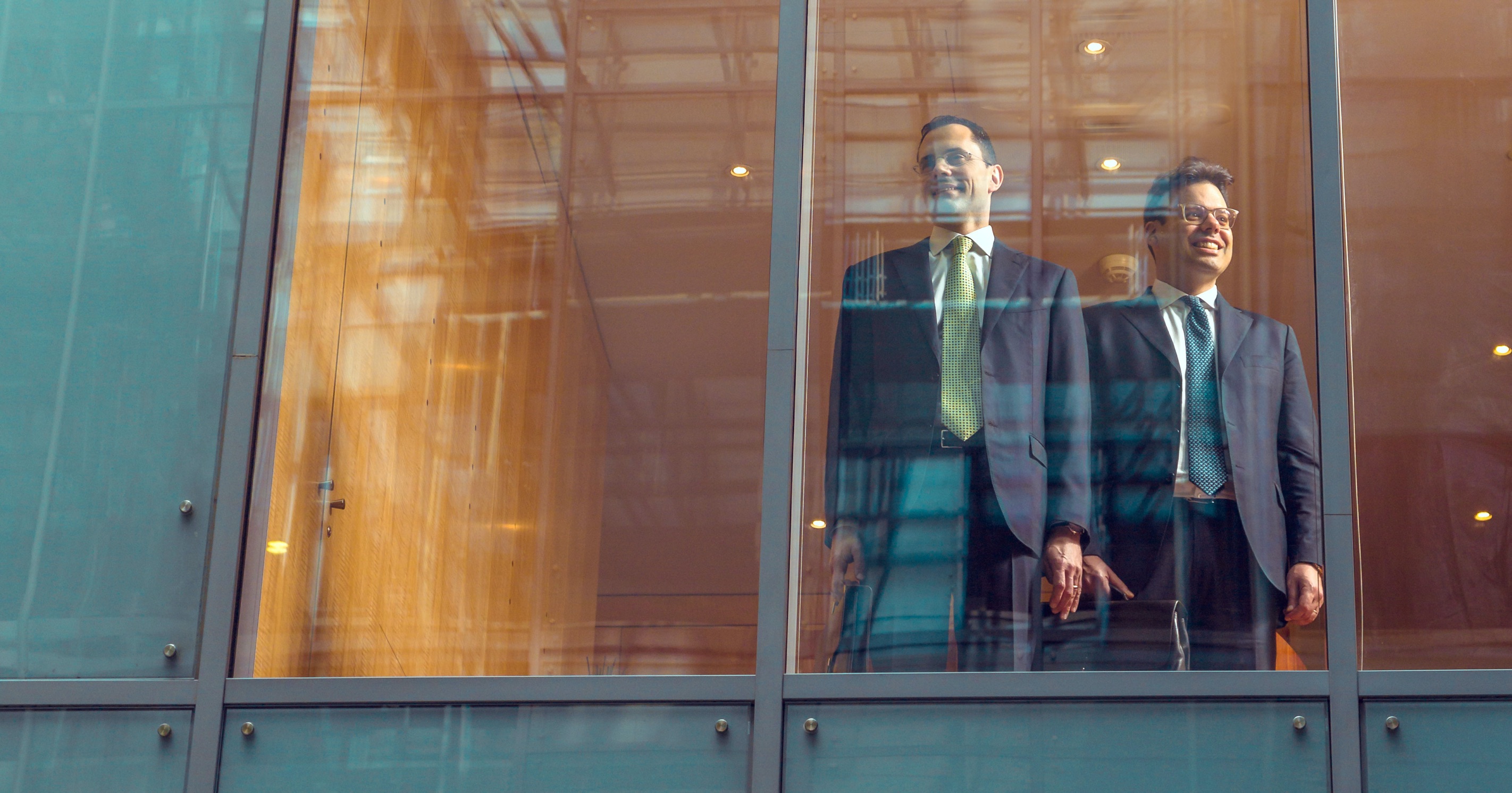
With this in mind, we created a tailored photo shoot that would tell the story of the two protagonists not only in the office, but also in the pursuit of their passions, capturing them in a port - in the case of Marco Comini, a boat enthusiast - and in their garage - in the case of Gianmaria Bernasconi, a motorcycle lover.
The photos were used as images for the magazine, which Aequitum still uses as a tool for promotion and awareness among customers and partners.
AEQ_Animated___

A one-page site, evolving with the business
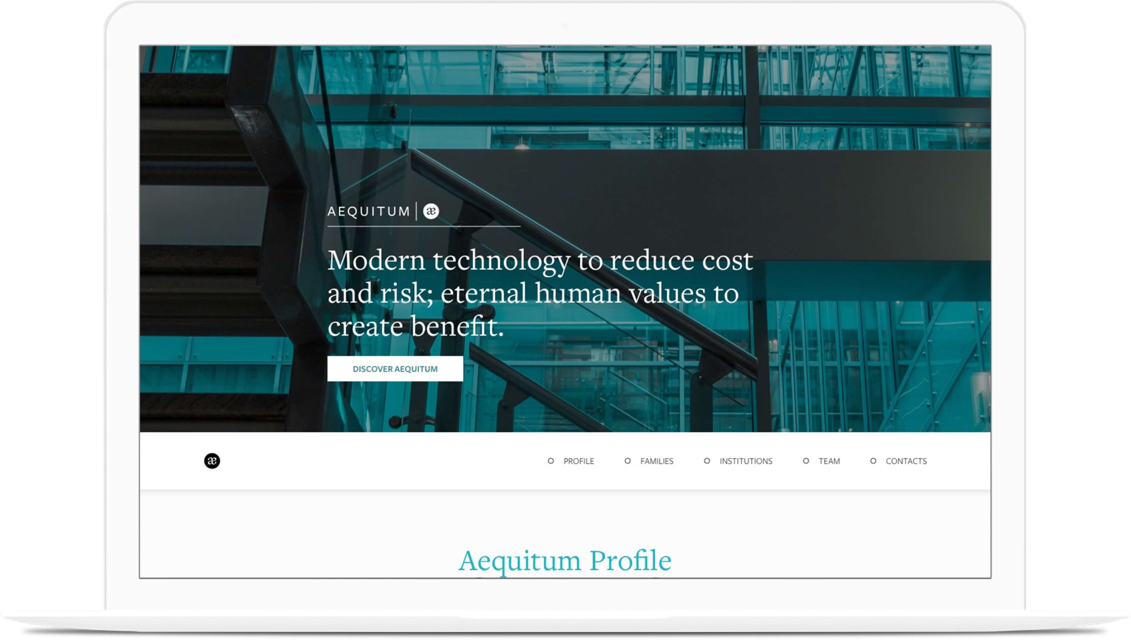
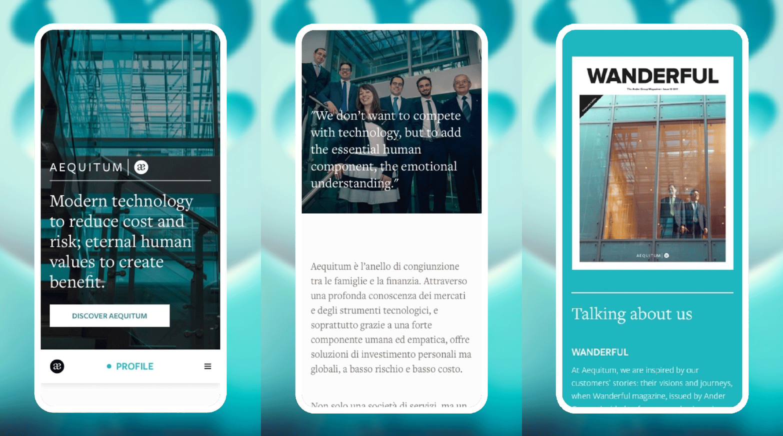
When Aequitum was born in 2016, it had a strong need to make its two founding partners known in the market and to tell what made it different from its competitors. For these reasons, in the creation of the one-page site that we proposed to the client in 2017, we gave  space to the photos of the two protagonists, this time in the company, so that an identification between brand and founders would be created in the users' mind.
The site was built with an anchor navigation and a block navigation, dedicated to the company profile, the service offered - Wealth Management for families - and contacts. When, in 2019, the company took on a different size - going from 3 to 6 people - and enlarged its target audience - no longer just families but also institutions - it became necessary to restyle the site.
AEQ_08

New dimensions, new target, new layout
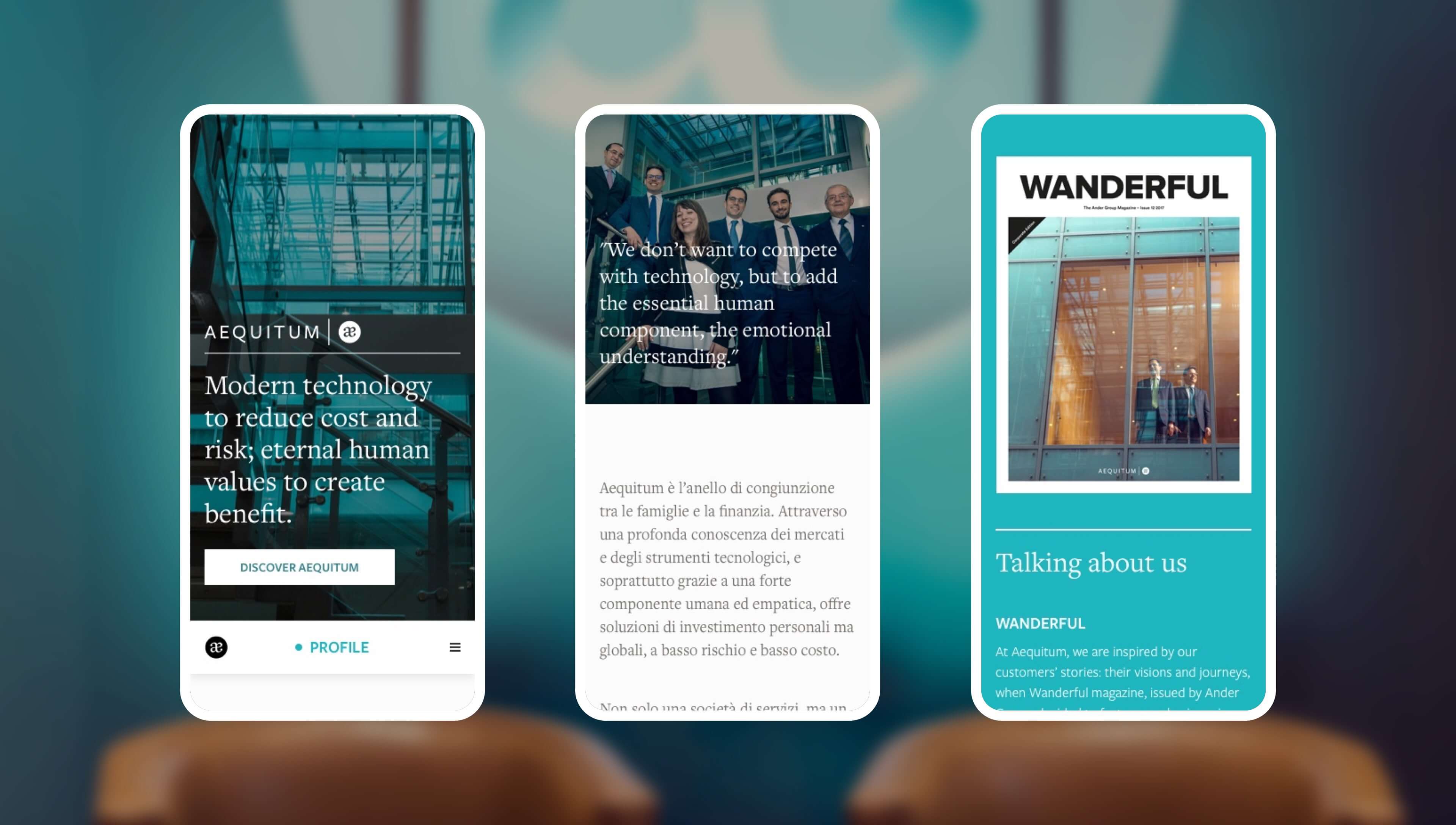
The restyling was an opportunity to expand the content, but also to make some changes to the layout: the goal was to make it more current and consistent with a growing company, no longer tied only to the two founders. For the photos, for this reason, we have reduced the presence of Marco Comini and Gianmaria Bernasconi, while we have instead introduced a module dedicated to the team with the photos and profiles of the 6 people.
As well as we have inserted a new module dedicated to the services offered to institutional customers, in terms of layout and user experience we eliminated the block scrolling (no longer very current: the trend changes quickly!), we have given more weight to the navigation menu, with a small animation that provides the coloring of the menu item corresponding to the section that the user is browsing, while the images are visible with a parallax effect.
AEQ_06
AEQ_17_mobile

Privacy policy and data processing

As part of the site restyling, we put the customer in a position to interact with the target audience, providing them  the necessary tools to do so and guiding them in the processing and management of data collected online. 
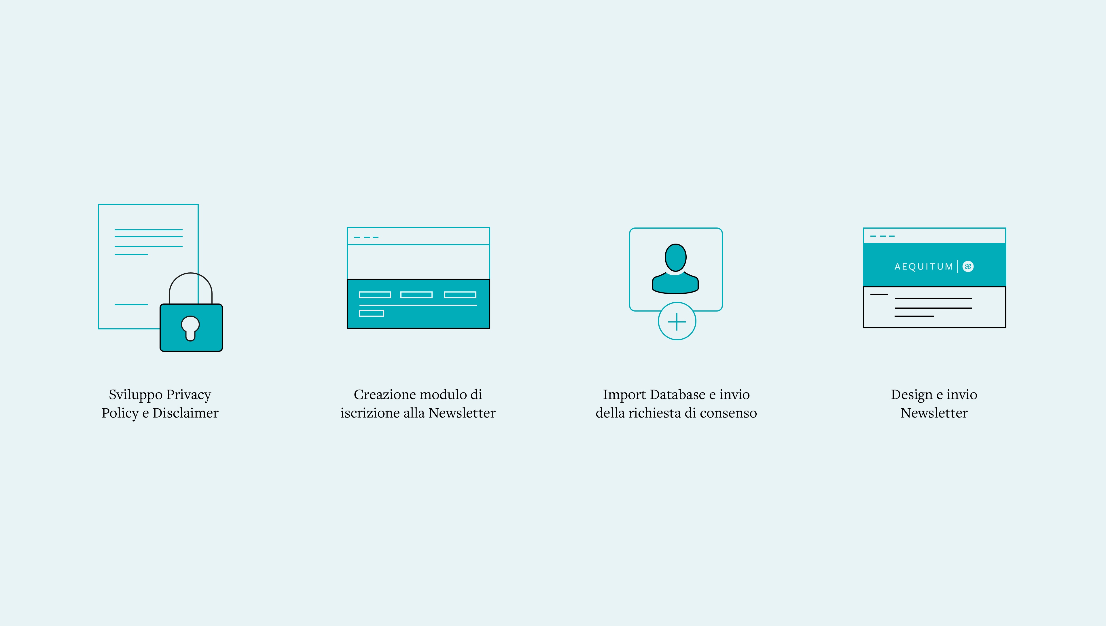
With the imminent entry into force of the new DPA (Data Protection Act) that will assimilate Switzerland to other European countries in terms of data processing by companies, it is essential for all brands to regulate these aspects: in particular for those who, like Aequitum, operate in such a delicate and "attackable" sector.
AEQ_09
AEQ_13

Legal support to protect the brand

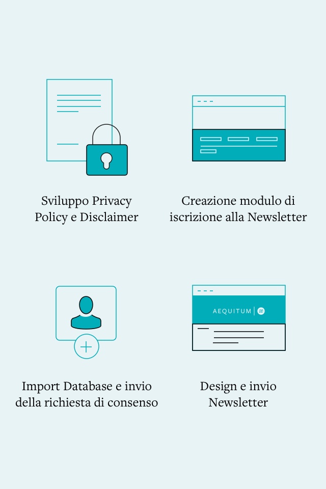
With the support of our legal advisor, we guided the client in the development of the privacy policy, a document that regulates the processing of data and the use of HubSpot and Mailchimp, and a disclaimer that protects Aequitum towards its public.
After verifying these legal aspects, we sent existing contacts a double opt-in communication to collect the addresses of those who wanted to receive communications from the client and, after segmenting the database according to language, we started sending periodic emails.
AEQ_10
AEQ_14

A newsletter to communicate with the target
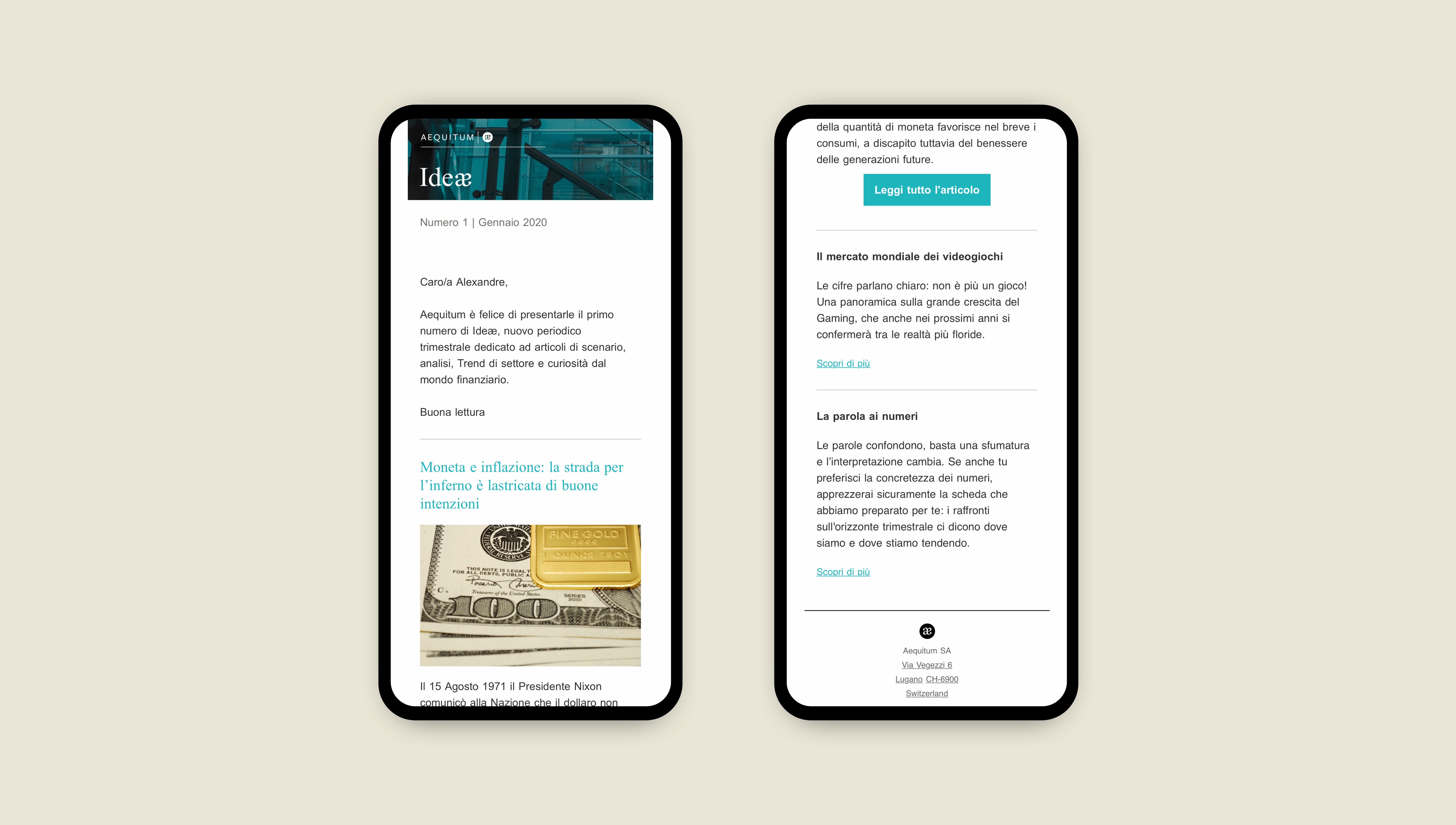
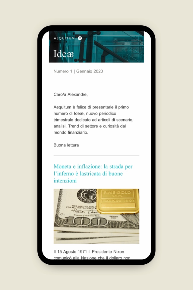
Among these, we created a quarterly newsletter linked to a section of content that can be updated on the website, dedicated to scenario articles, analysis, industry trends and curiosities from the financial world.
The ideal way to establish a lasting relationship of trust between the brand and its customers.
aequitum-1