Collaborative design for a new digital ecosystem
Client and goals
Cornèr Bank is one of the most important Swiss banks. Active both nationally and internationally, with strong roots in the Ticino region, it caters in particular to a high-level private clientele. After several projects with Ander Group in the past, Cornèr asked our help for the restyling of its website, with the aim of optimize the information architecture.
Identify the target and rethink the tone of voice; reorganize the way services are presented; give the bank a more elegant and 'clean' image, maintaining a link with the communication strategy in use.
Concept
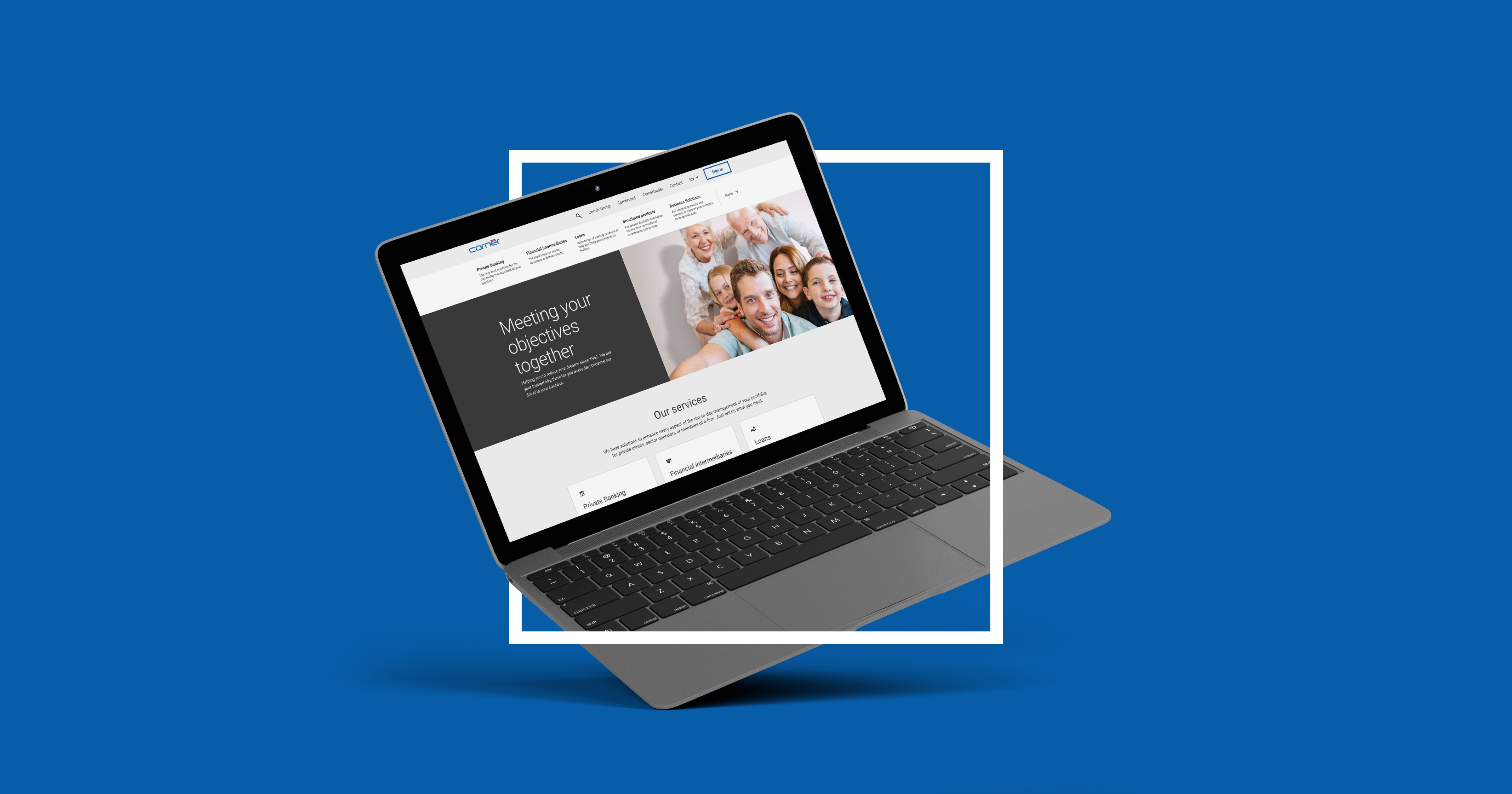
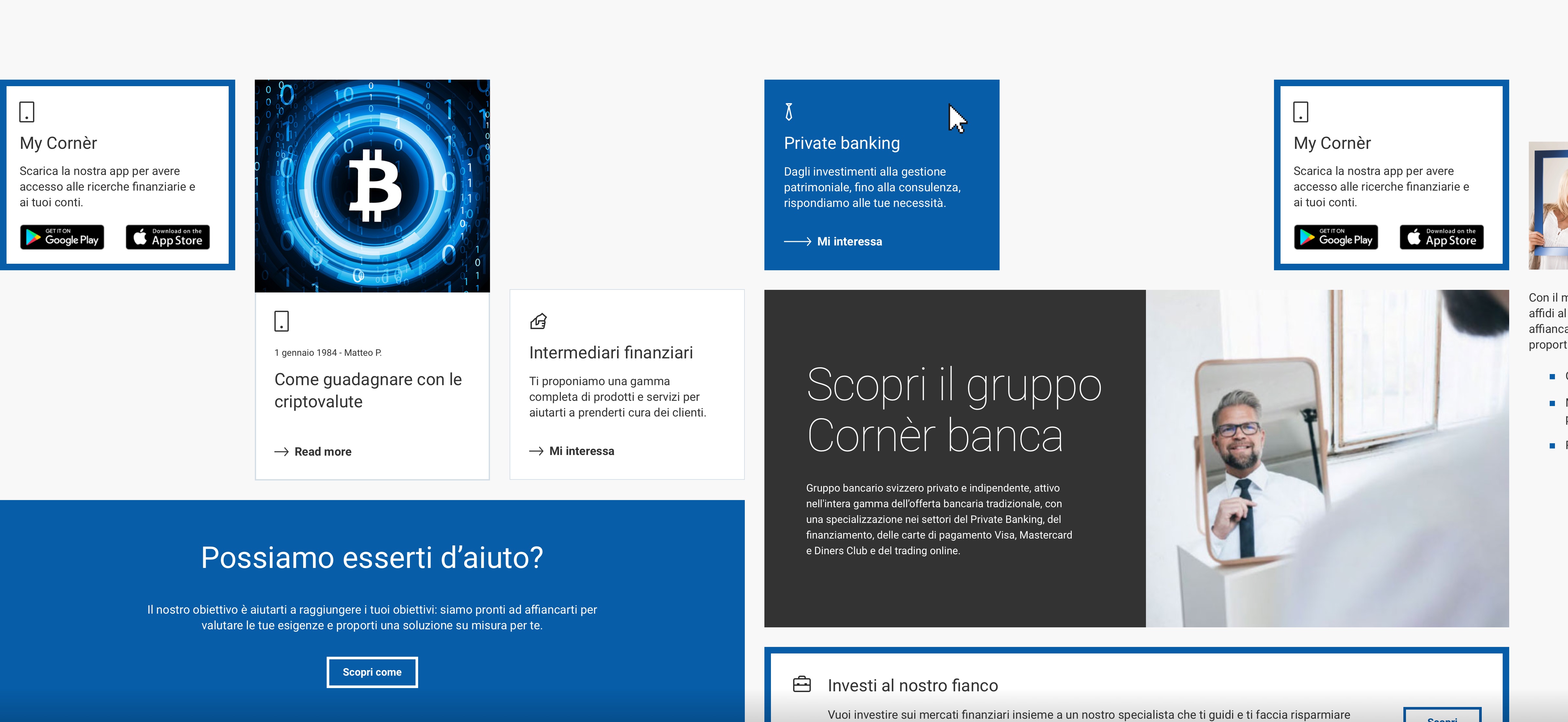
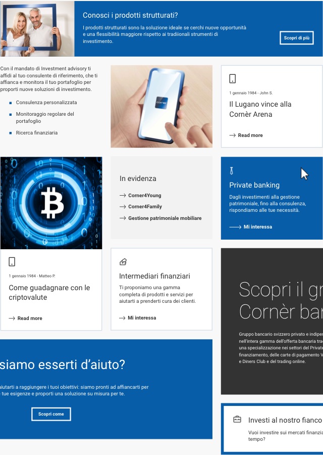
The starting point for the graphic concept of the site was the typical frame of Cornèr Bank's communication: an element that we simplified, made more essential and elegant and used not only in the images of the site, but also as a graphic element that encloses boxes and content. Overall, the mood of the site reflects the values of the bank: solid and traditional.
Design system
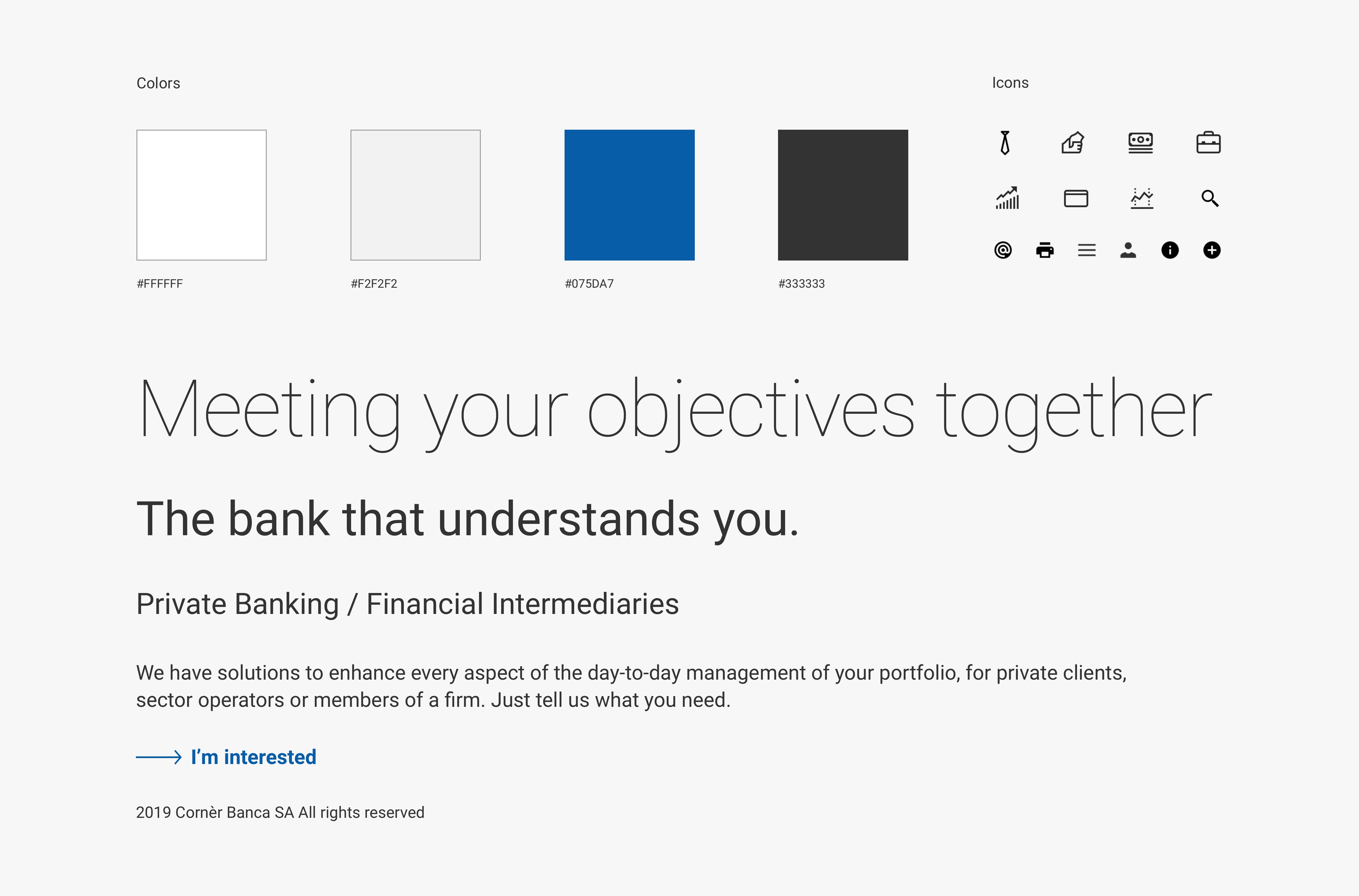
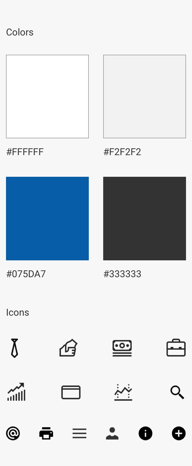
The first phases of the project revolved around the definition of the design system of corner.ch. We chose a color combination that did not deviate from the institutional colors of the Cornèr brand and was also functional to the user interface and the interactions between the elements.
The choice of the font fell on Roboto, a Google Font with geometric lines that well express the concept of the frame, but also contemplates sinuous curves for a comfortable reading. Everything has been featured by a library of customised icons to identify the various services offered by the group.
Interaction design
Through the interaction design, we introduced in the site some animations and interactions in order to give more dynamics to the site graphics., always focusing on the frame which is composed in different shapes and directions.
Atomic design
Atomic design is the creation of a digital product through the design of single micro-elements, put in relation with each other. It starts from the design of individual elements (atoms), which are related to each other in simple structures (molecules) or more complex (organisms), introduced within the templates and finally in the pages (layout).
Information architecture
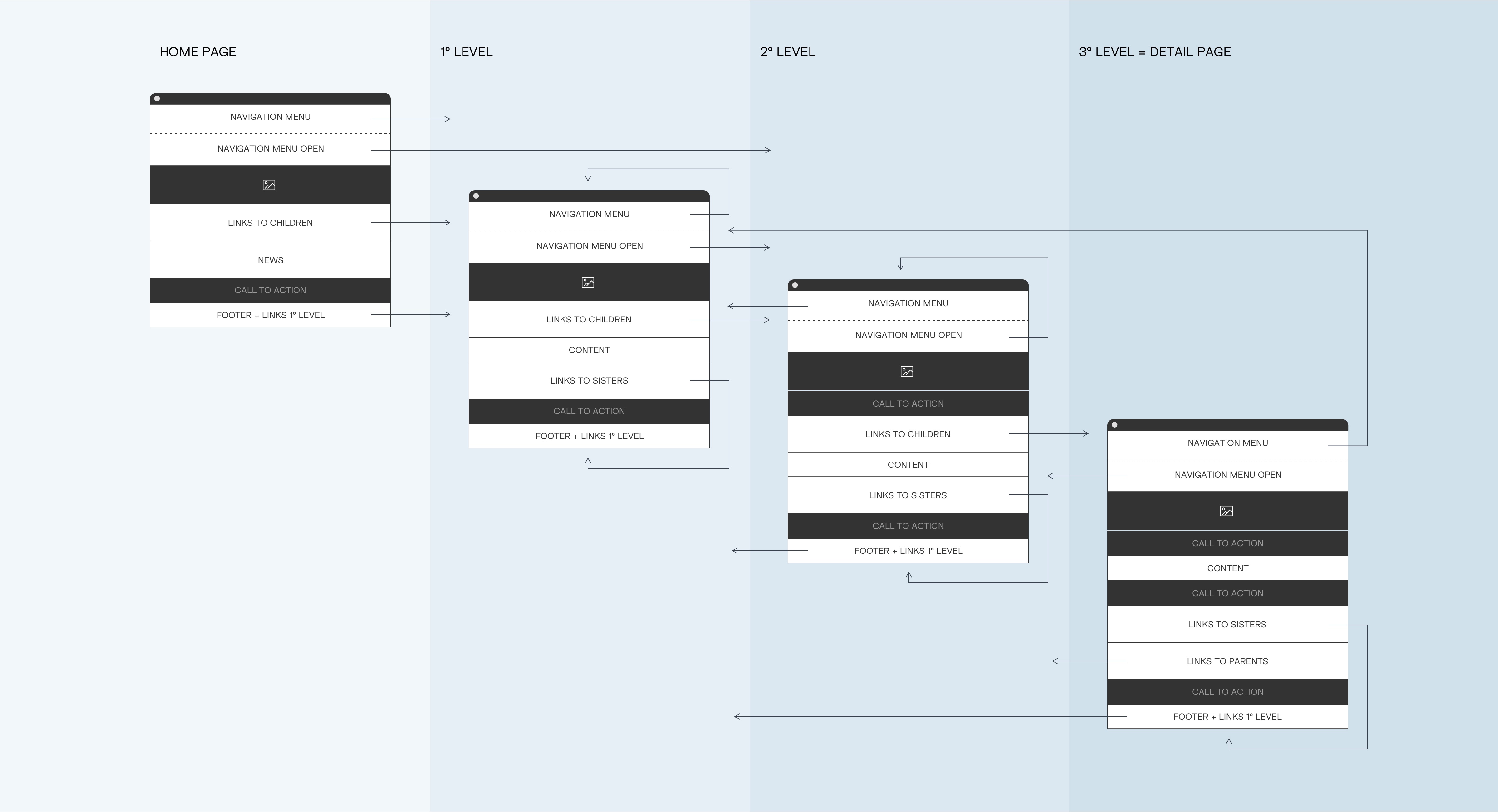
The complex structure and the heavy user experience were among the first issues that emerged during the meetings with the client: the bank's own employees had difficulty navigating the site and finding information. That's why we focused on a great work of content reorganization, eliminating superfluous menu items; moreover, we grouped services on the basis of real needs and customers' mental models, moving away from the previous structure that replicated the bank's corporate structure.
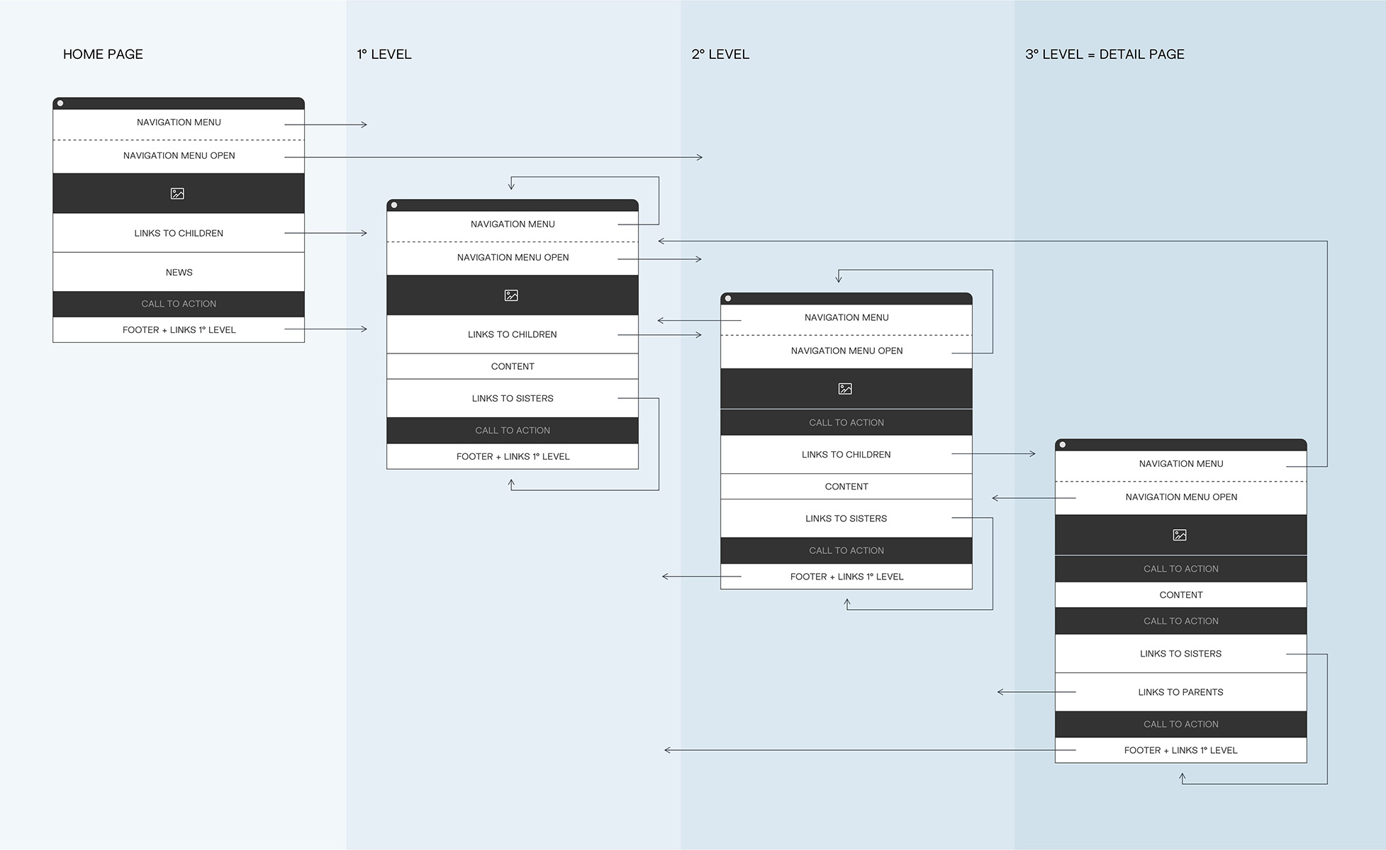
The new site provides a hierarchy that never goes beyond the third level of navigation. Moreover, the user always has the possibility to move to another section directly at the bottom of the page, without having to use the main menu: in the product pages it is always possible to go to the next level of depth or to go up again in the navigation flow.
Strategy and co-design
We set up the project with a logic of co-design, or collaborative design: all the most important decisions were taken during the workshops with the managers of the bank and the people of the marketing and communication team. This allowed all stakeholders to feel that the project was tailored, inviting them to be involved and to provide a contribution. In this way, the approval process was streamlined and response times were rapid.
Even the content writing was done side by side with the client: each area manager was involved in several content writing workshops, with the aim of putting the correct concepts on the table and at the same time translating them into an engaging and SEO-friendly form, which took into account the keyword research done in the initial phase. The tone of voice was slightly detached from what the bank has done in the past: the style is informal but reassuring, direct but never joking.
Site development
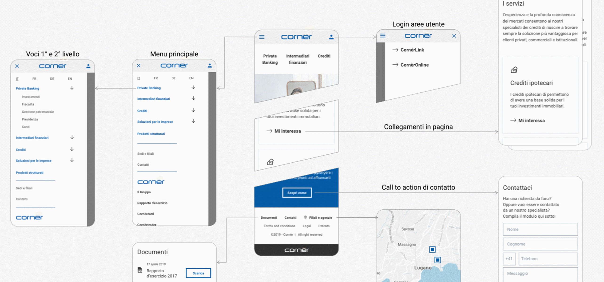
During the final phases of the project, we organized a hand over of the digital formats (Sketch and HTML), so the IT department of the client could manage the development of the pages autonomously.